
§ PROJECT · DATA ANALYSIS | DATA VISUALIZATION
Medicaid Spending Explorer.
An interactive map of how every state spends its Medicaid budget, built so a reader can move from the national picture to one state's breakdown in a single click.
§ Data study
Where Medicaid money goes, state by state
Medicaid spending by type of service in federal fiscal year 2024. Select a state on the map, or from the list, to see how its spending breaks down.
View all states as a table
§ 01 - OBJECTIVE
One number hides fifty-one programs.
Medicaid spent $918.7 billion on services in fiscal year 2024. The figure is accurate and close to useless on its own. Every state and D.C. runs its program differently, and the national split between service types describes very few of them. The aim was to show both levels at once: where the money goes nationally, and how far any one state departs from it.
§ 02 - OBJECTIVE
Scale drowns the signal.
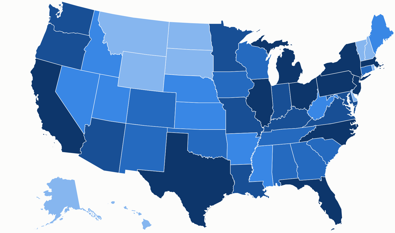
California spent $150.4 billion. Wyoming spent $767.5 million, about 196 times less. On a straight color scale, California and New York sit at one end and almost every other state lands in the same pale band. I grouped states into fifths instead. Each color holds about ten states, so the map shows where a state ranks. The exact figure is one click away.
§ 03 - INTERACTION
Two levels of detail, one click.
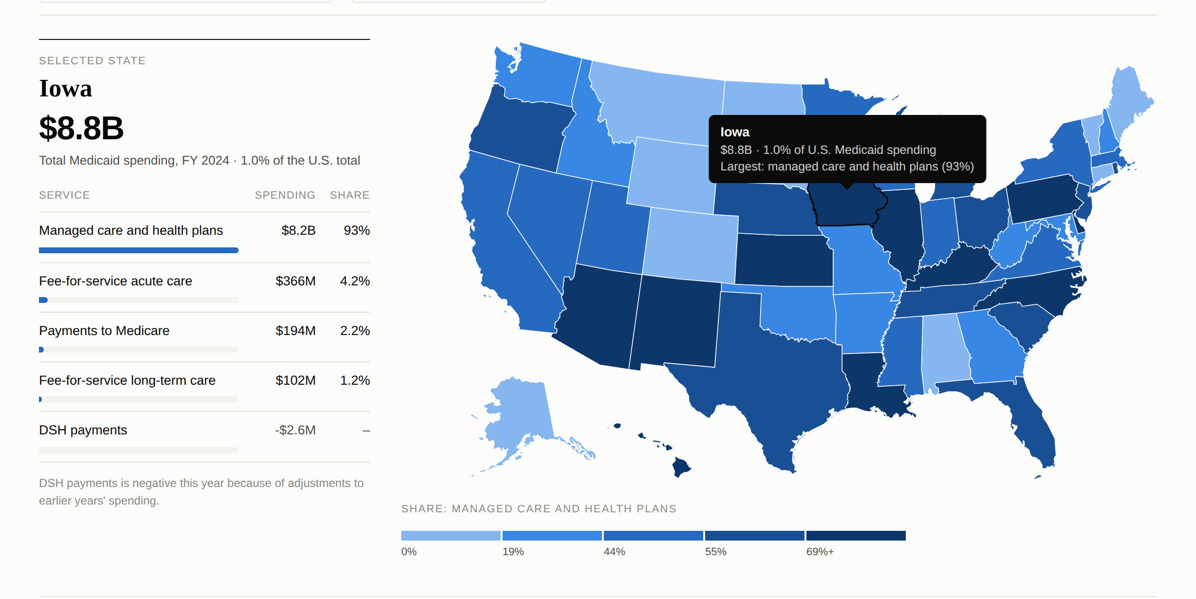
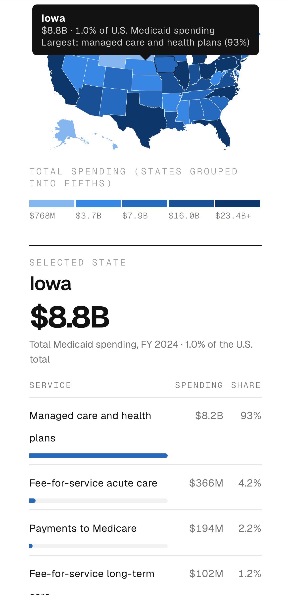
Clicking a state opens a short summary over it: total spending, its share of the national total, and its largest category. The table beside the map fills with the full breakdown.
Rhode Island, Delaware and D.C. are too small to click reliably, so a state list sits above the map. Every state can also be reached by keyboard, and a full table of all fifty-one sits below.
§ 04 - FINDINGS
What the map shows.
Managed care leads, with clear exceptions. It accounts for 53% of national spending and is the largest category in 36 states. In eight states it is under 5%: Alabama, Alaska, Connecticut, Maine, Montana, South Dakota, Vermont and Wyoming. In Iowa it is 93%.
Spending is concentrated. California and New York account for 26.8% of all Medicaid service spending. The five largest states account for 41%.
Long-term care leads in two states. In North Dakota and New Hampshire, fee-for-service long-term care is the largest category, at 55% and 40%.
Corrections show up as negative spending. Five states report negative DSH payments (extra payments to hospitals that serve many low-income patients) for the year, Massachusetts by $109.2 million. The figures include adjustments to earlier years.
§ 05 - THE DATA
Reading it correctly.
Figures come from KFF's estimates based on CMS Form 64 data, as of September 2025, for federal fiscal year 2024. They exclude administrative costs and the U.S. territories.
A low fee-for-service share does not mean a state spends less on that care. In Iowa, most care is paid through managed care plans and recorded there. The note under the map mentions this, so readers don't have to work it out for themselves.
§ 06 - OUTCOME
A single file that travels.
The original version was built through an agency partnership, and its core idea carries over: a pop-up on the state and a full breakdown beside the map. This rebuild uses public data and runs as one self-contained file, with no external libraries or tracking. It works on any site and on mobile devices, and next year's figures can replace this year's in one place.
§ RELATED
More work.
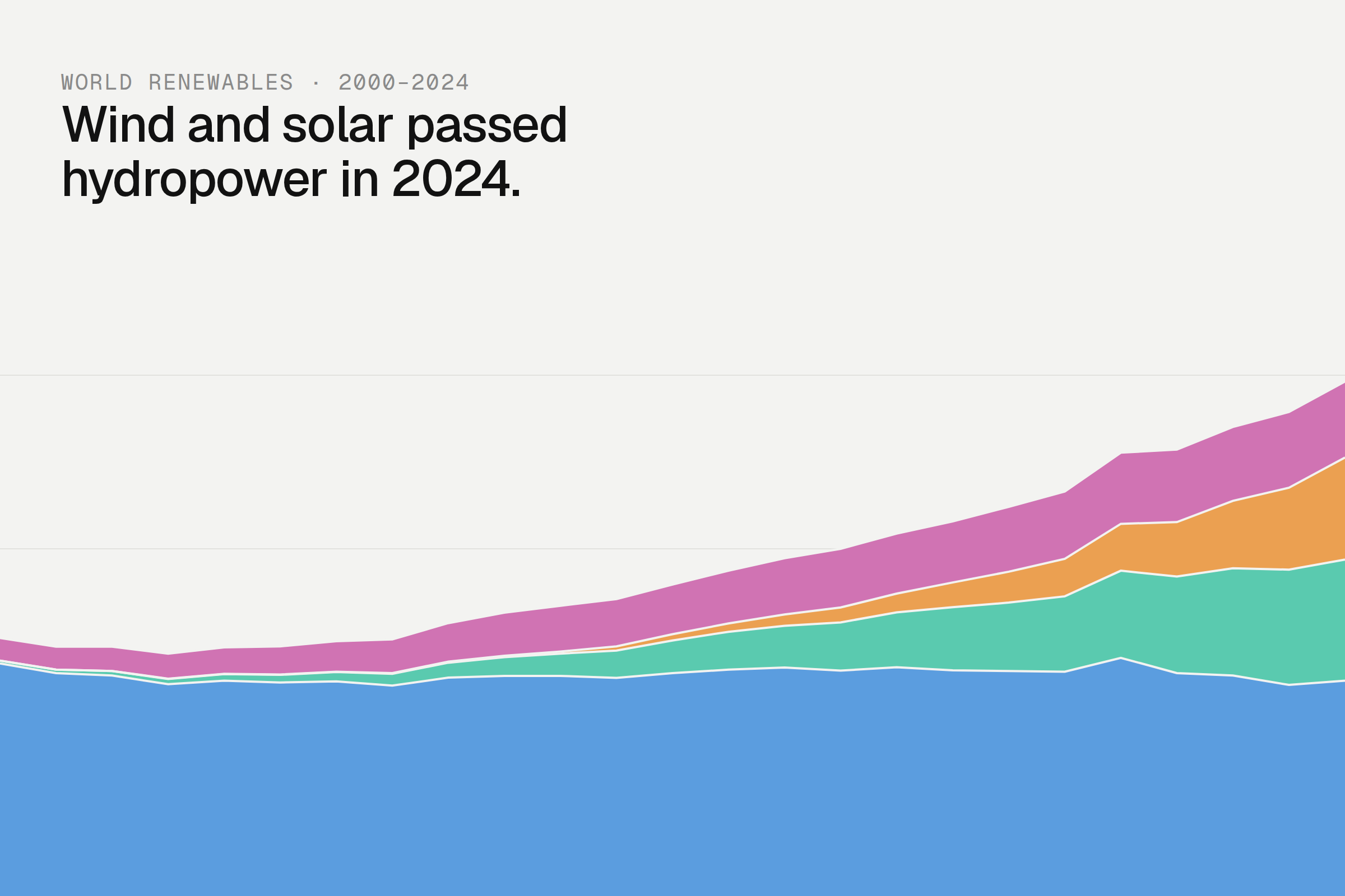
Renewable Energy Shift
DATA ANALYSIS & VISUALIZATION

KALD
IDENTITY

Emily Salisbury
IDENTITY & STRATEGY, WEB DESIGN