§ PROJECT · BRAND IDENTITY
KALD.
Brand identity for a premium northern coffee label. A utilitarian visual system that finds its character in the landscape rather than the category.
§ 01 · VISION
Coffee crafted for the cold.
The brand is crafted for those who find comfort in the cold and ritual in the early morning hours. By bridging the gap between harsh, rugged environments and the rich comfort of a hot cup, Kald offers a premium coffee experience for the adventurous spirit.
§ 02 · OBJECTIVE
Balancing utility and refinement.
The goal was to communicate premium quality through absolute simplicity rather than arbitrary decoration. By leaning into clean, functional typography and a stripped-back aesthetic, the visual identity feels entirely authentic whether it’s braving the raw elements outdoors or sitting refined on a modern kitchen counter.
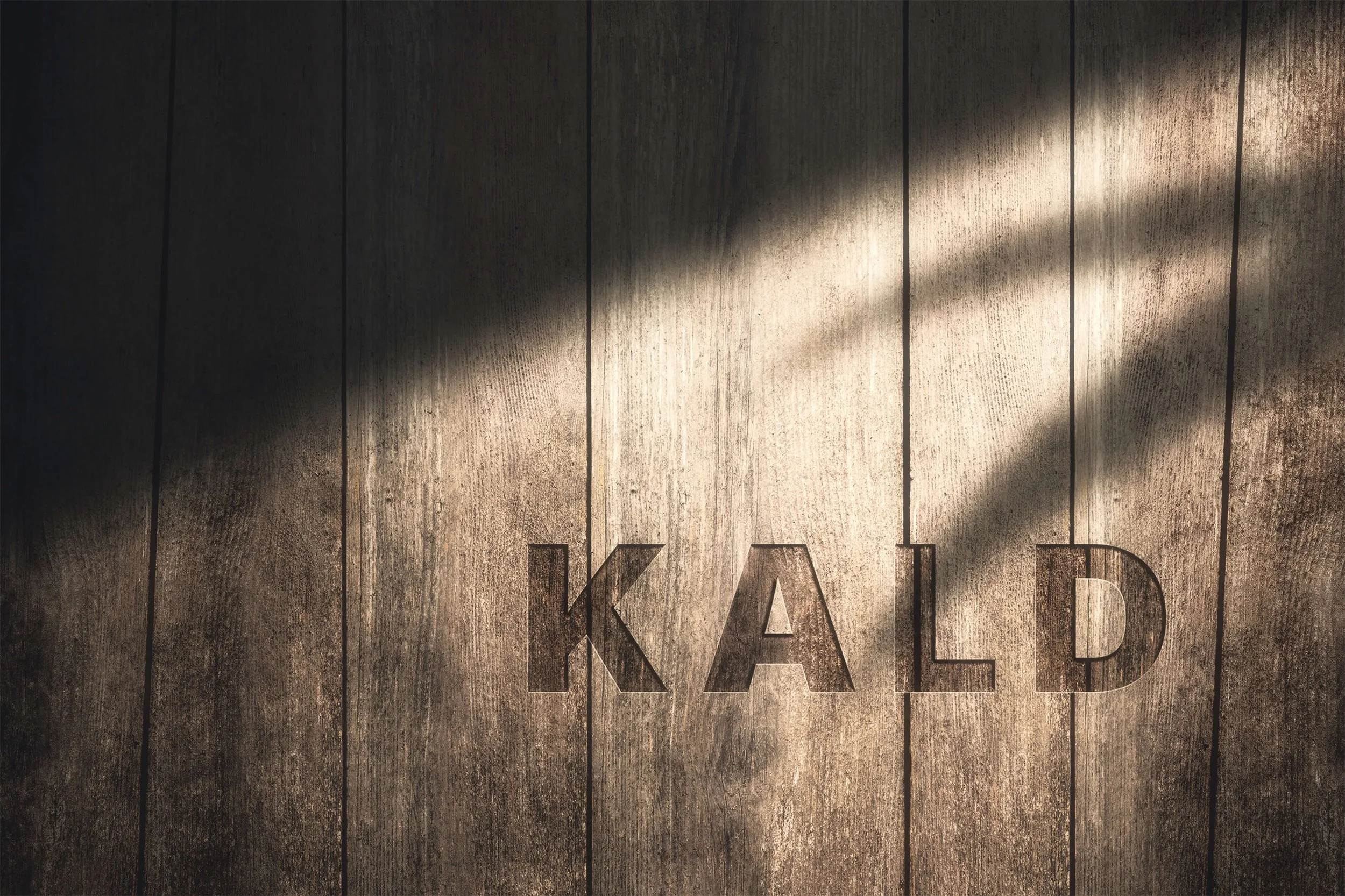
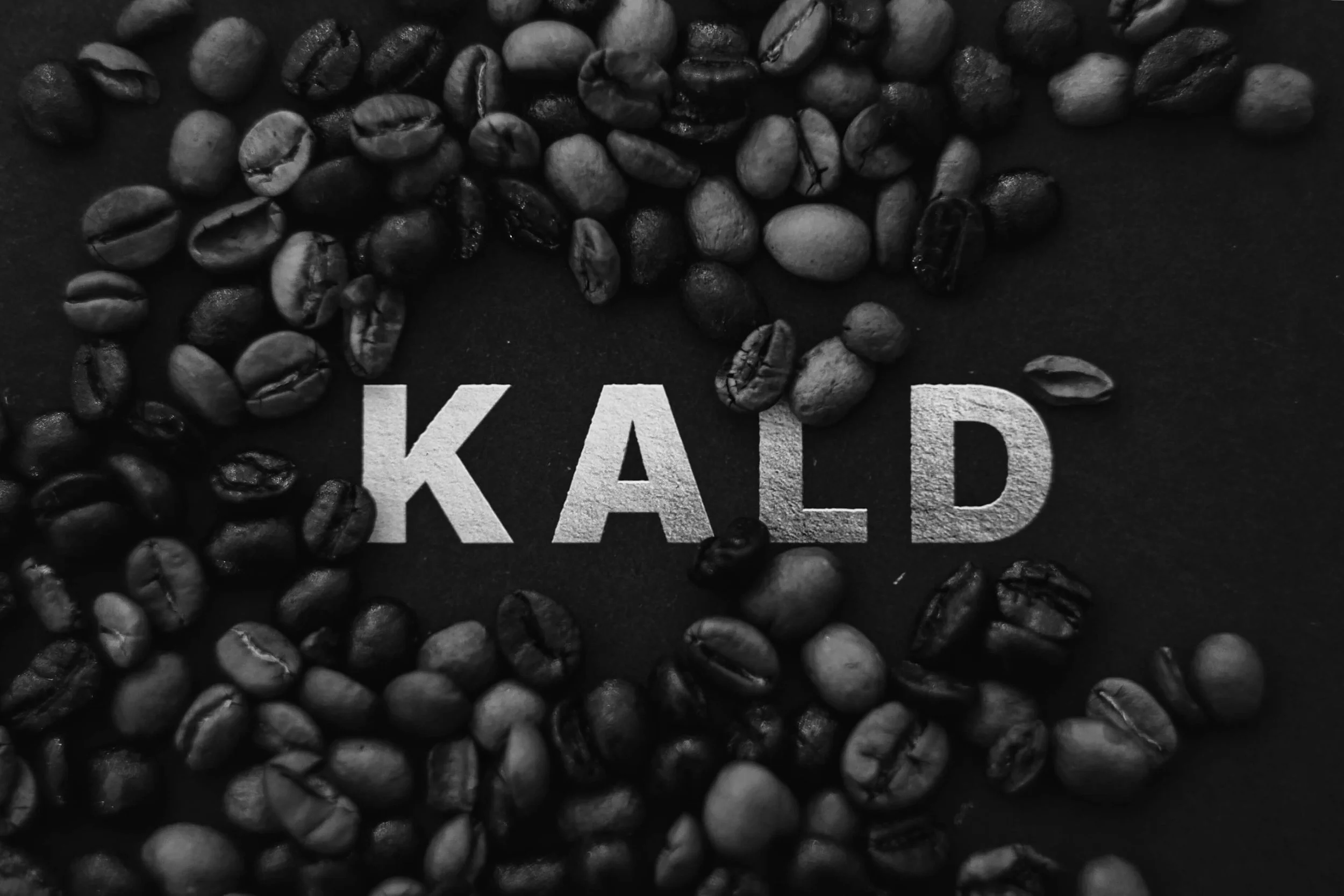
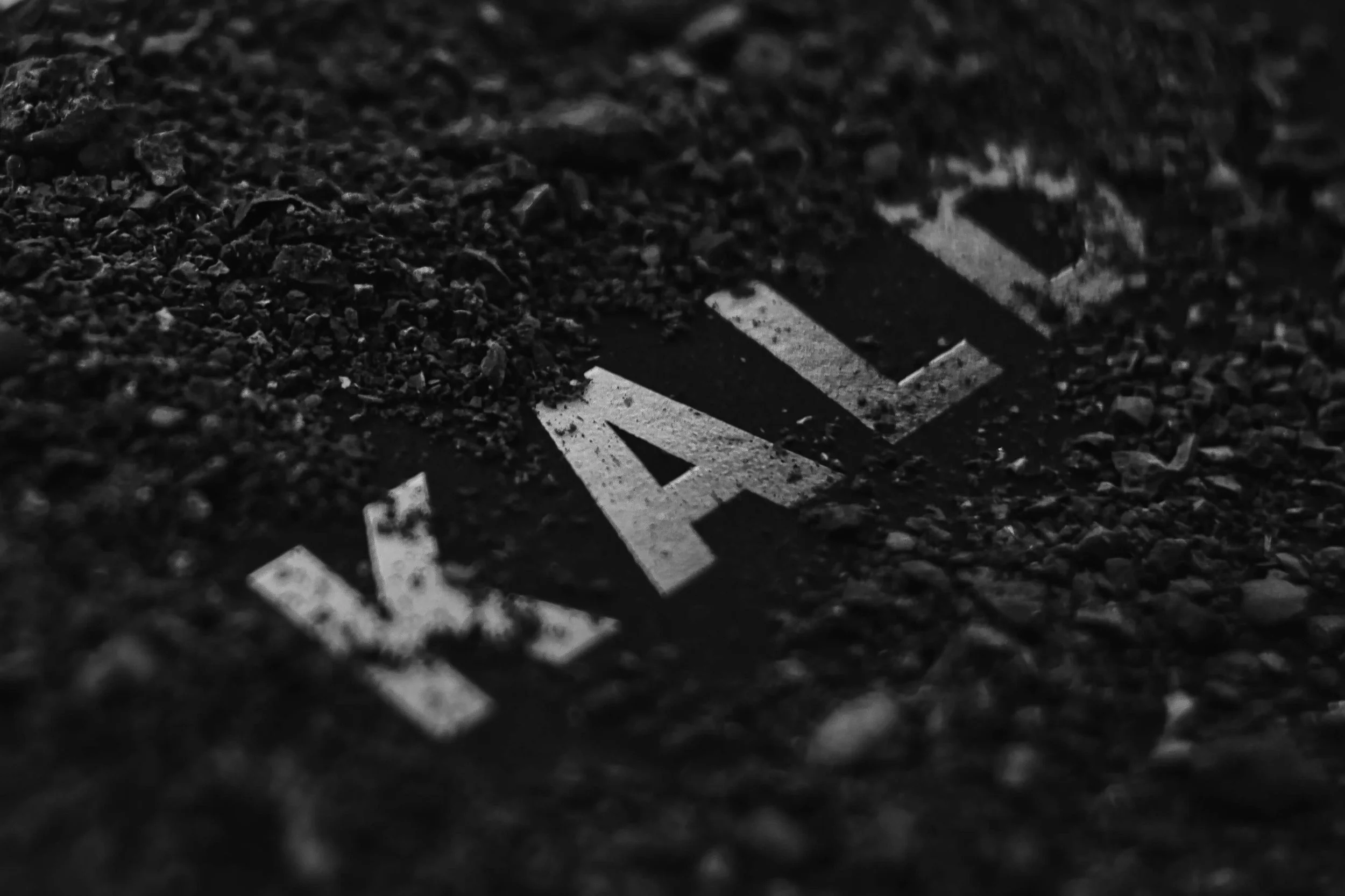
§ 03 · IDENTITY
Built on raw simplicity.
A heavy, unadorned typeface anchors the brand, signaling resilience and function. By stripping away unnecessary ornamentation, the logo functions as a bold stamp of quality that commands attention.

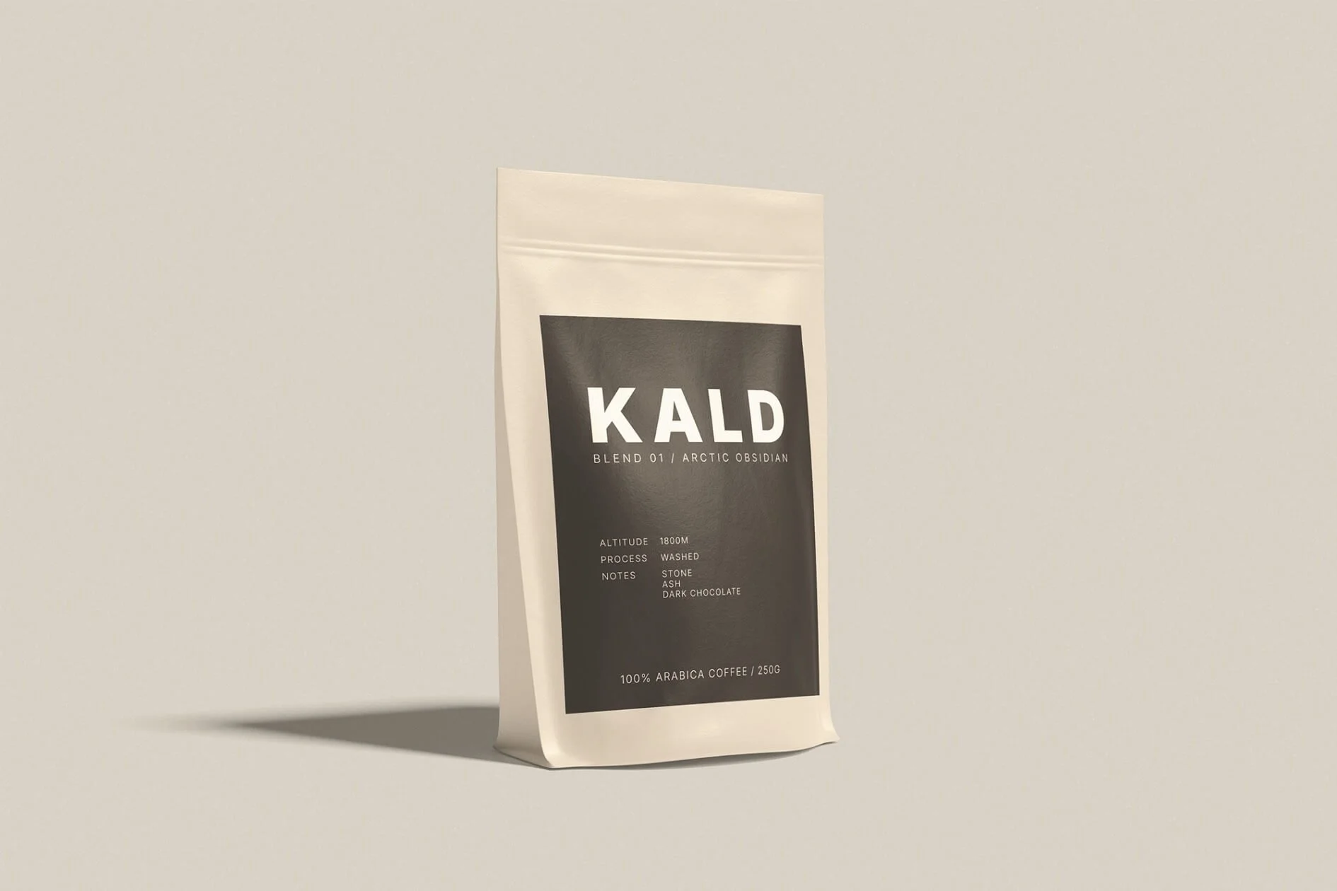
TYPOGRAPHY
Utilitarian sans
Inter is used across all applications for absolute clarity, providing a stable, functional typographic foundation.
PALETTE
Northern neutrals
A mix of rich espresso charcoal and soft cream. The colors evoke both a warm brew and the raw textures of arctic stone.
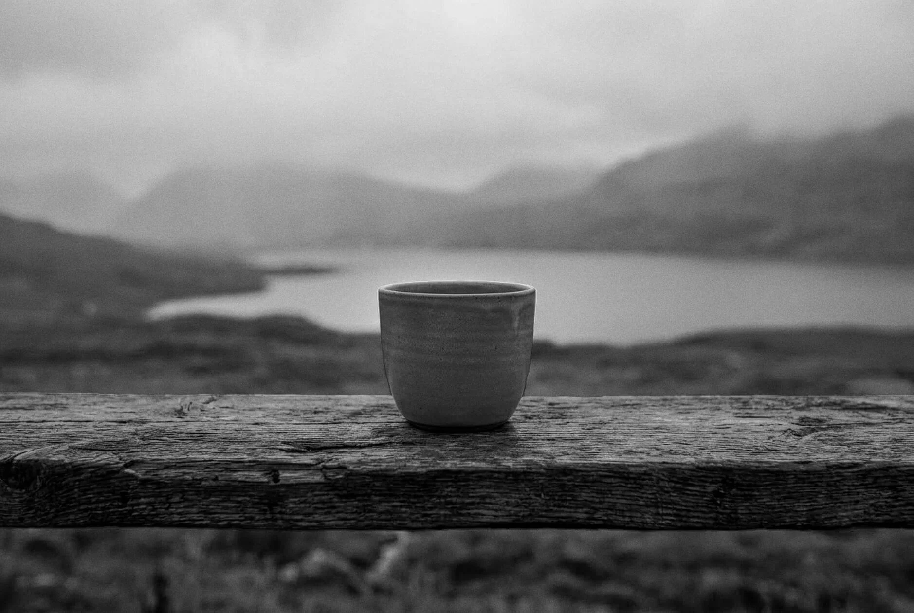
CHARACTER
Atmospheric & Resilient
High-contrast, silver-toned imagery focuses on elemental textures to capture a grounding, timeless mood.
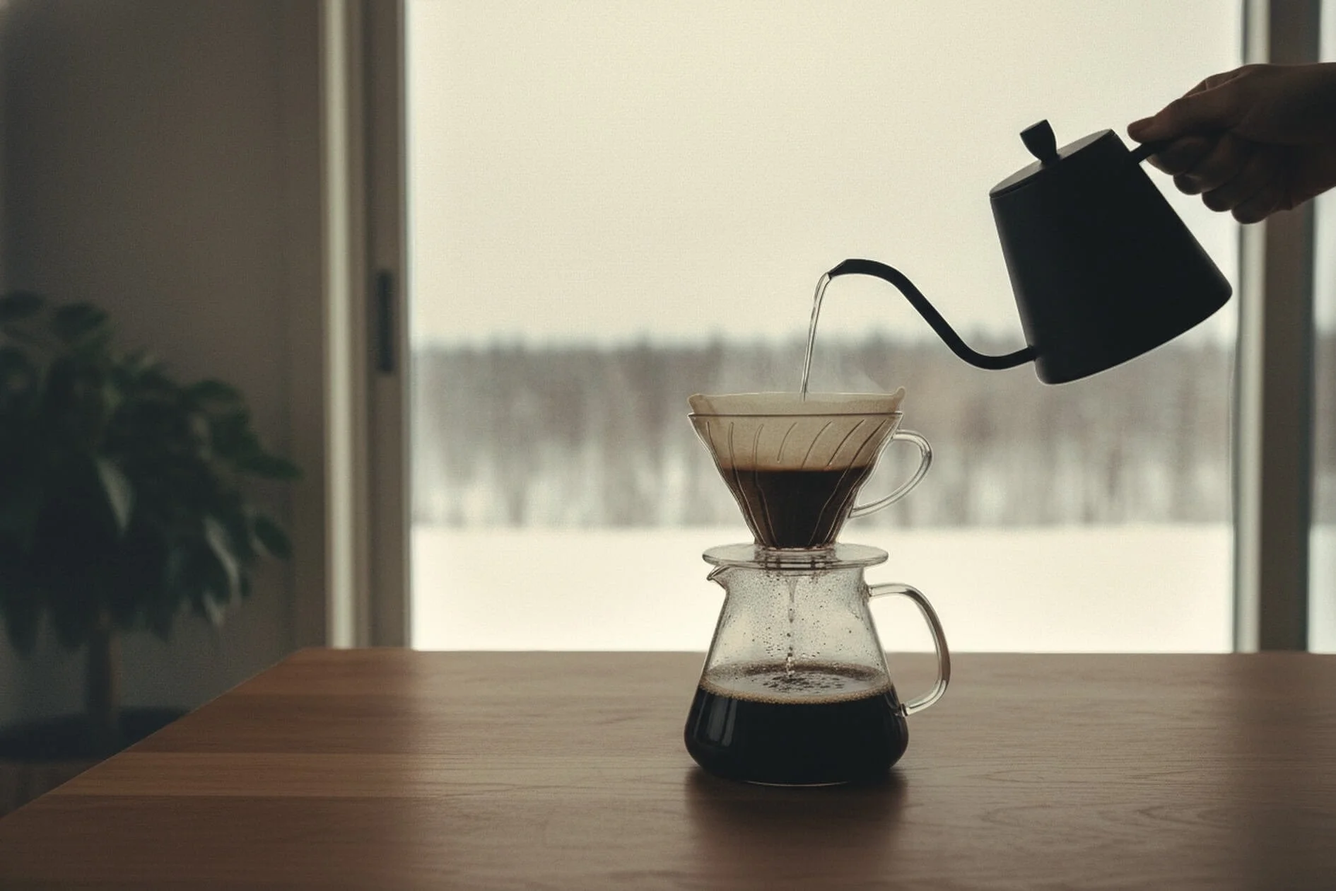
§ 04 · SURFACES
Designed for any environment.
The visual system scales seamlessly across packaging, apparel, and signage. Utilitarian by design, the identity remains uncompromised across contexts—built for a condition, not an occasion.
§ 05 - OUTCOME
Distinction through restraint.
Kald successfully introduces a raw, landscape-driven perspective to the premium coffee market. The final identity proves that a brand can command a premium space through quiet authority rather than loud marketing.
§ RELATED
More work.

Nature with Nicola
IDENTITY & STRATEGY, WEB DESIGN
Roast & Toast
IDENTITY

Emily Salisbury
IDENTITY & STRATEGY, WEB DESIGN