
§ PROJECT · BRAND IDENTITY & STRATEGY | WEB DESIGN
Nature with Nicola.
A complete brand foundation for a seasonal herbal medicine practice, rooted in an identity that reflects historic botanical precision and quiet, literary depth.
§ 01 · VISION
Focus on narrative and origin.
Run by herbalist and published writer Nicola Sabin, the practice brings together clinical herbalism, traditional plant energetics, and seasonal living. To establish a public presence from scratch, the project required a complete brand foundation—uniting identity, voice, copy, and photography direction into a cohesive visual ecosystem, with a fully designed website serving as its central home.


§ 02 · OBJECTIVE
Establishing credibility beyond the wellness aesthetics.
To separate the practice from mainstream wellness cliches, the brand identity centers on clinical focus and literary depth. The design uses spacious compositions and a deliberate layout flow to communicate authority from the first glance. The visual presentation handles the heavy lifting of building trust, allowing the copy room to breathe.
§ 03 · IDENTITY
Designing a visual identity around the practitioner.
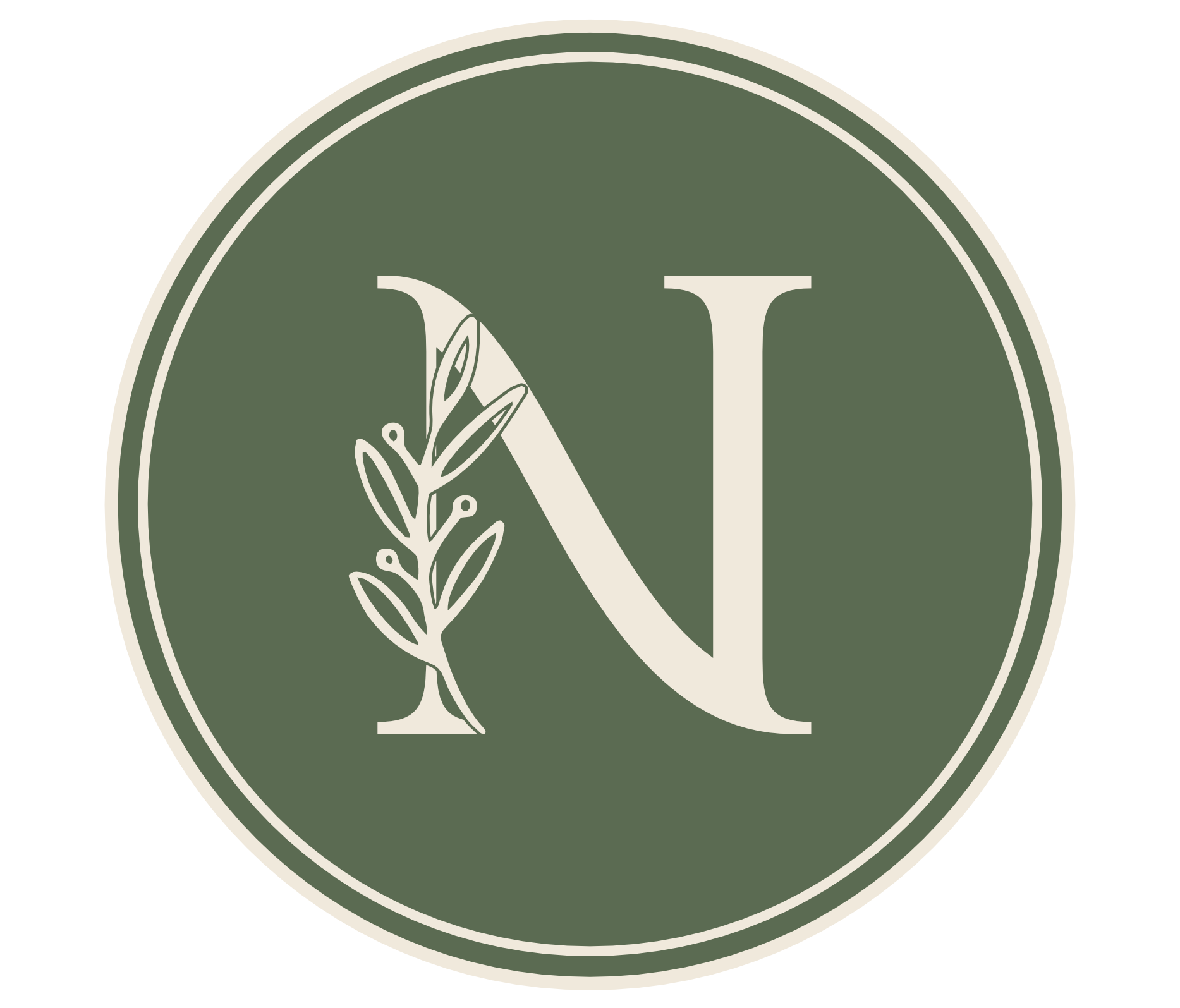
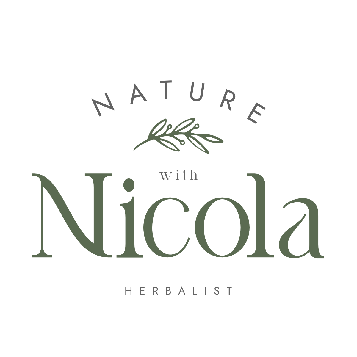
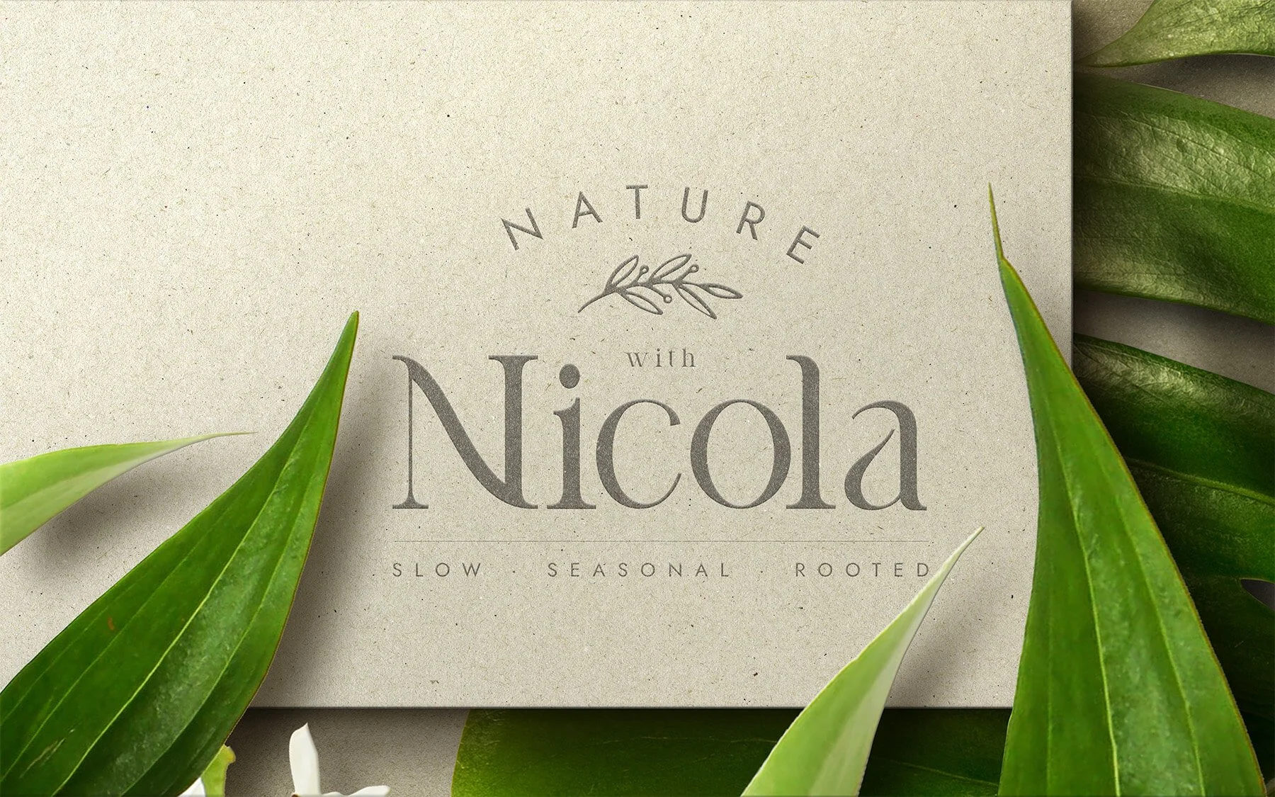
Nicola’s writing has a rare patience and specificity, and the visual identity needed to match that cadence. Built around the practitioner herself, the logo features "Nicola" in a dominant, italic serif, framed by an observed botanical illustration that ties the natural world directly to the person. It is a highly flexible system, adapting seamlessly from small collateral navigation to large-scale displays.
§ 04 · TYPOGRAPHY
An elegant visual language rooted in botanical warmth.
DISPLAY · HEADLINES

Cormorant Garamond carries the headings, display text, and pull quotes. Its fine strokes and organic curves bring the quality of early botanical illustration text to every heading: precise without stiffness, historical without period costume. At large sizes it creates stillness. That quality was the requirement.
TEXT · BODY

Jost handles the functional layer: body text, navigation, captions, labels. Set at light weight throughout, with generous line-height. It gives the prose room to breathe, the same instruction given to the layout and to the copy itself. The pairing works because both fonts move in the same direction. One through character. The other through restraint.
§ 05 · COLOR PALETTE
The British landscape, at the turn of the season.
Muted greens, warm linens, earthy ambers, a single deep forest tone as anchor. The primary register: Moss, Sage, Oat, Dust, Deep. These carry the visual weight of the brand across every page and application.
§ 06 · WEB DESIGN
Translating a literary voice into a digital space.
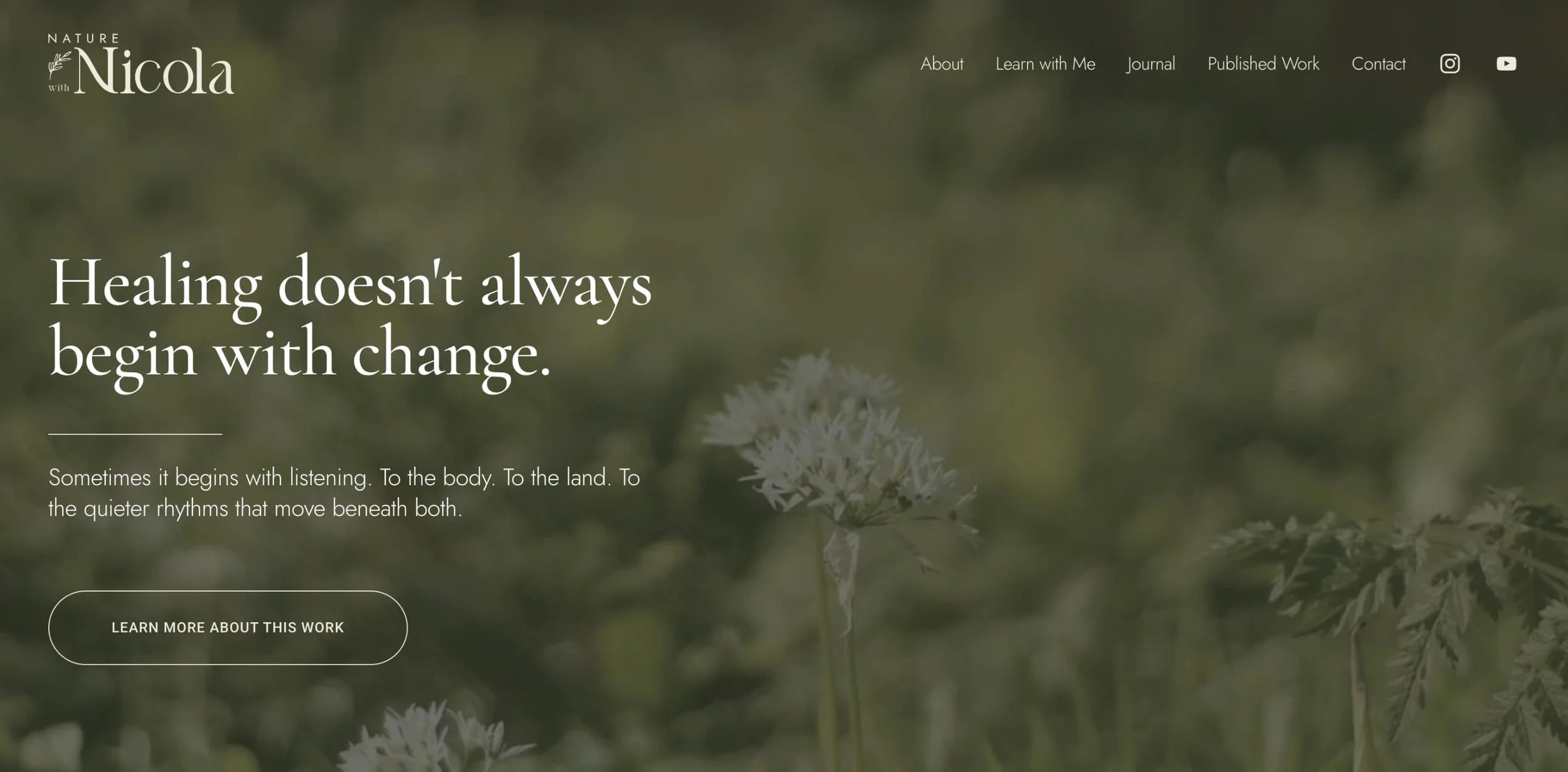
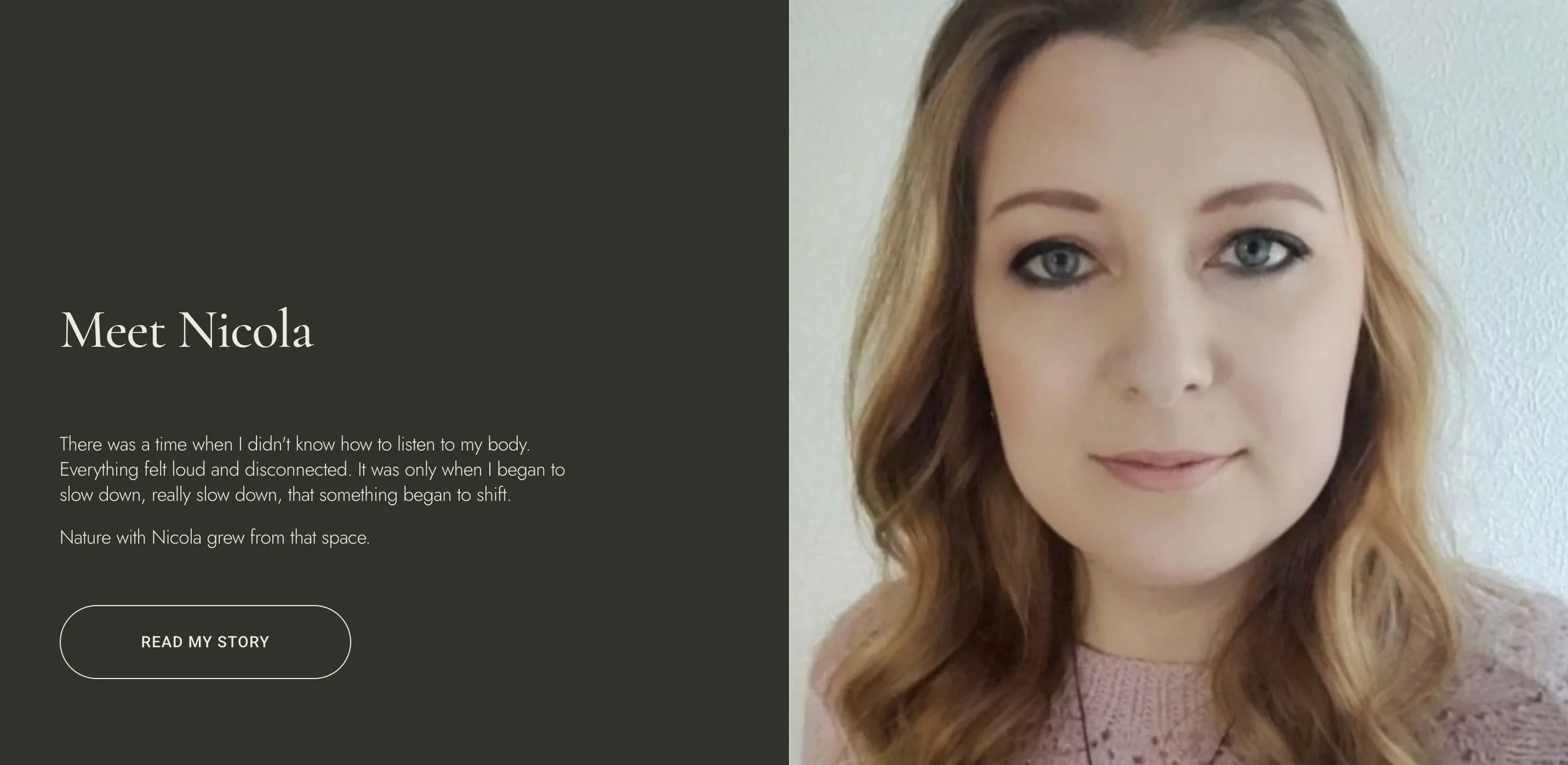
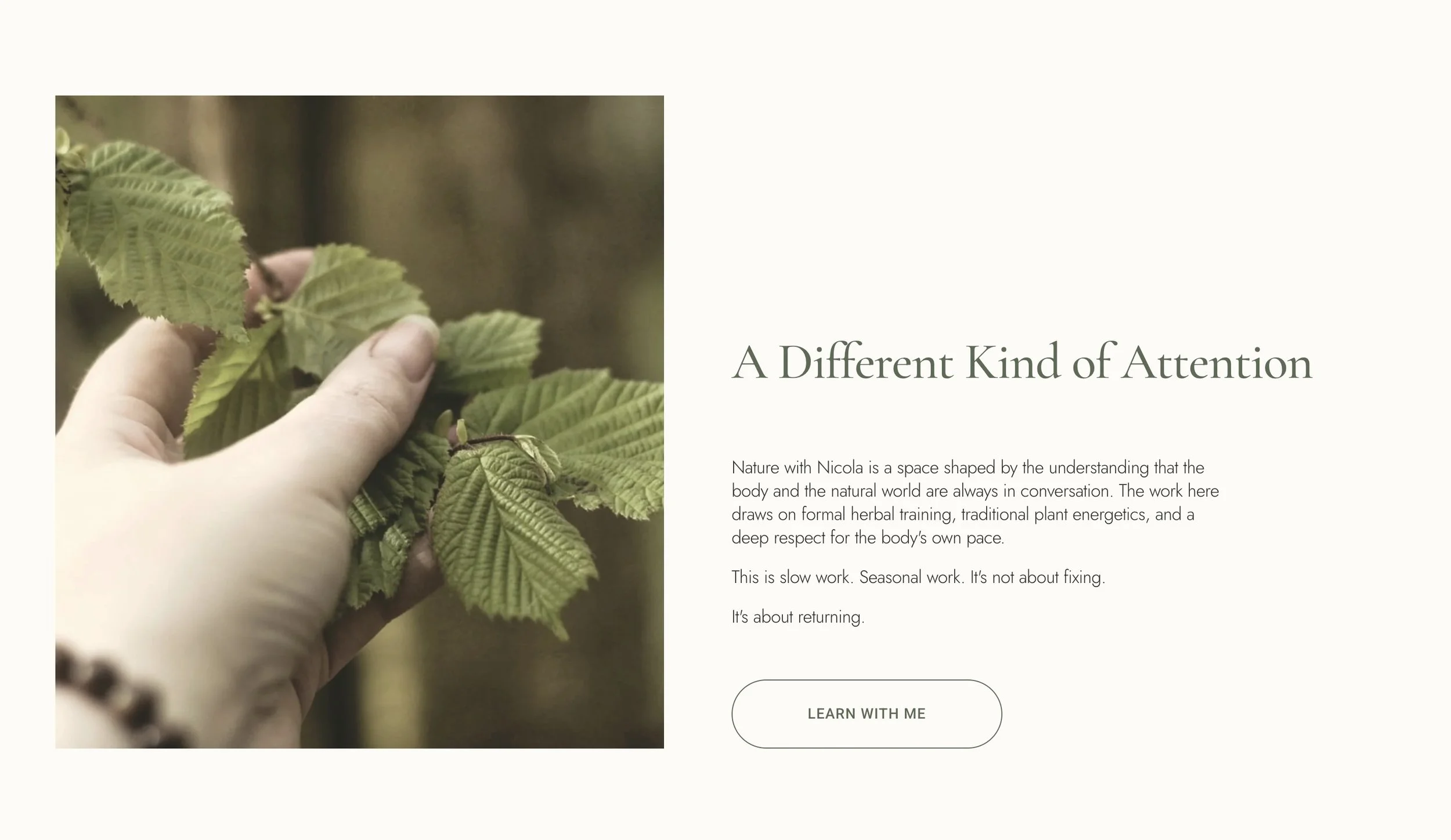
The built site spans six core pages: Home, About, Learn With Me, Journal, Published Work, and Contact. To make the platform read as Nicola’s own writing rather than a generic digital presence, every layout was built from the ground up to let white space and rhythm carry the claim of credibility. By giving the prose generous room to breathe, the digital interface reduces cognitive noise and enacts the brand’s calming quality before a user reads a single line of copy.
§ 04 — ON RECORD
Since launching my brand and website, I've seen a significant shift in professional opportunities and visibility. Editors, publishers, and event organisers can now quickly understand who I am and the value of my work, without me having to explain it. That clarity has led to a regular column with an international herbal publication, five magazine articles accepted across multiple titles, speaking invitations, and a publisher requesting a full manuscript review for my forthcoming book.
Working with Alex was a genuinely collaborative process. He took time to understand not only what I do, but why I do it. The result is a brand identity and platform that supports real business and career growth.
§ 07 - OUTCOME
A complete brand foundation that holds both rigor and warmth.
The project successfully delivered a complete brand foundation for a practice that previously had minimal public presence. Every element was built from scratch: brand voice and style guides, site architecture, and six pages of original copy. The resulting ecosystem successfully holds a slow, literary herbal medicine practice where clinical rigor and personal warmth coexist beautifully without either diluting the other.
§ RELATED
More work.
KALD
IDENTITY
Danika
IDENTITY
Emily Salisbury
IDENTITY & STRATEGY · WEB DESIGN
Have a project that needs this kind of care?
Send a note and we'll work through it together. You'll receive an honest read on whether the engagement is the right fit for what you're building.