
§ PROJECT · BRAND IDENTITY & STRATEGY | WEB DESIGN
Emily Salisbury.
A brand identity and digital platform for a leading criminologist in gender-responsive justice reform. Built to make a vast body of rigorous research navigable for the policymakers and practitioners applying it.

§ 01 - OBJECTIVE
Structuring a life of research.
The goal was to synthesize a massive catalog of academic data into a functional framework for policymakers and practitioners. By prioritizing clean layouts and strict typographic hierarchies, the digital interface makes dense, complex subject matter highly navigable without diminishing its weight.

§ 02 - CHALLENGE
Breaking the institutional mold.
Criminal justice platforms are typically bureaucratic, closed off, and overly formal. Emily’s work required a visual language that communicates rigorous academic authority to researchers while remaining entirely approachable to the practitioners implementing reform on the ground.

§ 03 - IDENTITY
Authority with a human center.
The identity rejects cold, institutional aesthetics in favor of a thoughtful, structured, and confident tone. The primary mark balances academic credibility with the compassionate, reform-focused nature of her data, establishing immediate professional trust.


§ 04 - TYPOGRAPHY
The typeface references academic publishing.
DISPLAY · HEADLINES

Serif typography carries strong psychological associations with trust, credibility, and authority, making it well suited for communicating research-driven work and professional expertise.
TEXT · BODY

To balance this formality, a modern sans-serif typeface was introduced for interface elements and supporting content. This pairing creates a clear typographic hierarchy while improving legibility across digital layouts and long-form reading.
§ 05 - COLOR PALETTE
Warmth meets credibility.
Deep blue tones maintain professional authority, while soft lilac and cream accents strip away the sterile feeling of typical government or legal sites. Color is applied with restraint to naturally guide the eye through long-form publications.
§ 06 - WEB DESIGN
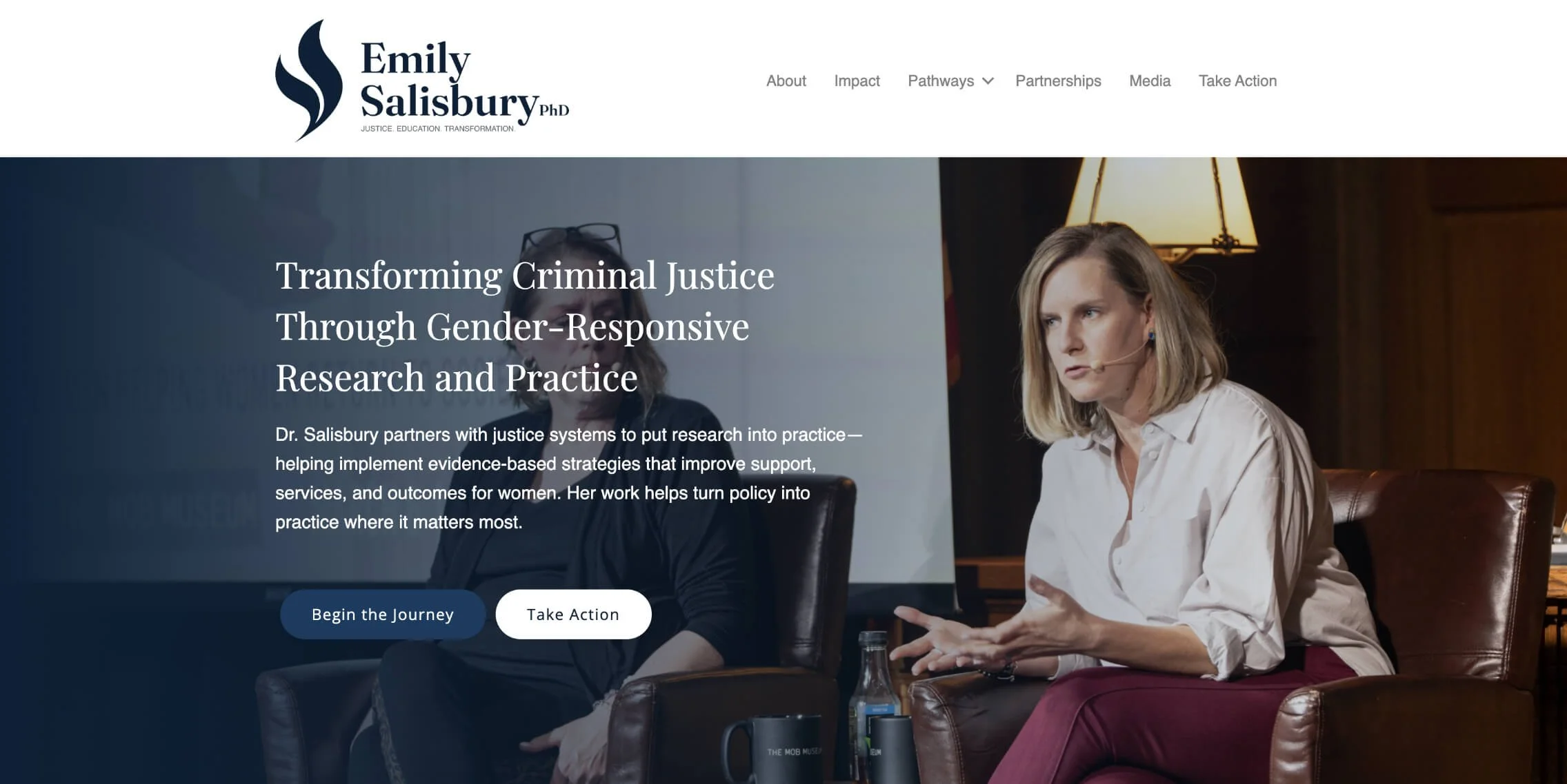
Translating the brand identity into a clear, structured digital experience.
The digital platform organizes Emily’s initiatives into distinct, digestible content pillars. Utilizing generous grid spacing and structured layouts, the site transforms a dense academic index into an open, highly readable resource for active justice system practitioners.
§ 07 - OUTCOME
The identity clearly communicates scope and impact.
The completed project effectively positions Emily Salisbury as a premier voice in justice reform. By combining a disciplined visual system with clear information architecture, the platform balances intellectual depth with real-world utility, built to scale as her public engagement grows.
§ RELATED
More work.

Elevated Ethos
IDENTITY & STRATEGY · WEB DESIGN

Roast & Toast
IDENTITY

Nature with Nicola
IDENTITY & STRATEGY · WEB DESIGN
Have a project that needs this kind of care?
Send a note and we'll work through it together. You'll receive an honest read on whether the engagement is the right fit for what you're building.