§ PROJECT · BRAND IDENTITY
Breathe Yoga.
§ 01
Project overview.
Breathe Yoga Studio teaches yoga to busy professionals. People who want the practice and keep pushing it down the schedule. The wellness category's visual language tends toward the soft, flowing, and natural: signals that communicate calm through familiarity. The project question was whether a brand could do the same without reaching for that library. Whether calm could be structural rather than decorative.
§ 02
Objective.
Design a logomark that reads as calm and considered — minimal without feeling empty, approachable without the soft edges generic wellness branding relies on
Hold the line between accessible and credible, a brand that works for someone's first class and for the practitioner who's been in the room for a decade
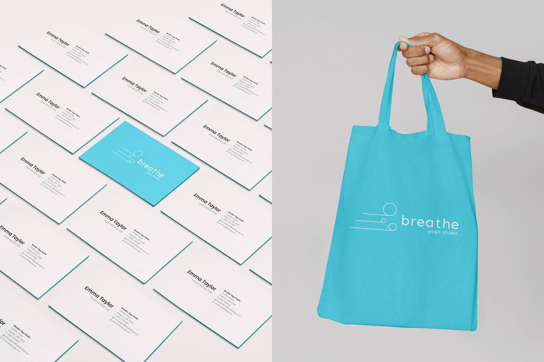
Build a color system that carries the brand from a business card to a billboard without losing character in either direction
§ 03
Identity.
TYPOGRAPHY
Sen - one family, one system
The wordmark and supporting type share the same typeface family at different weights. No contrasting faces, no script elements. The warmth comes from the mark, not from typographic variety.
PALETTE
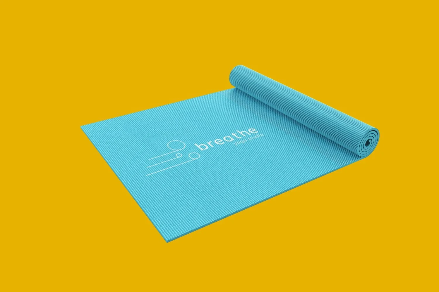
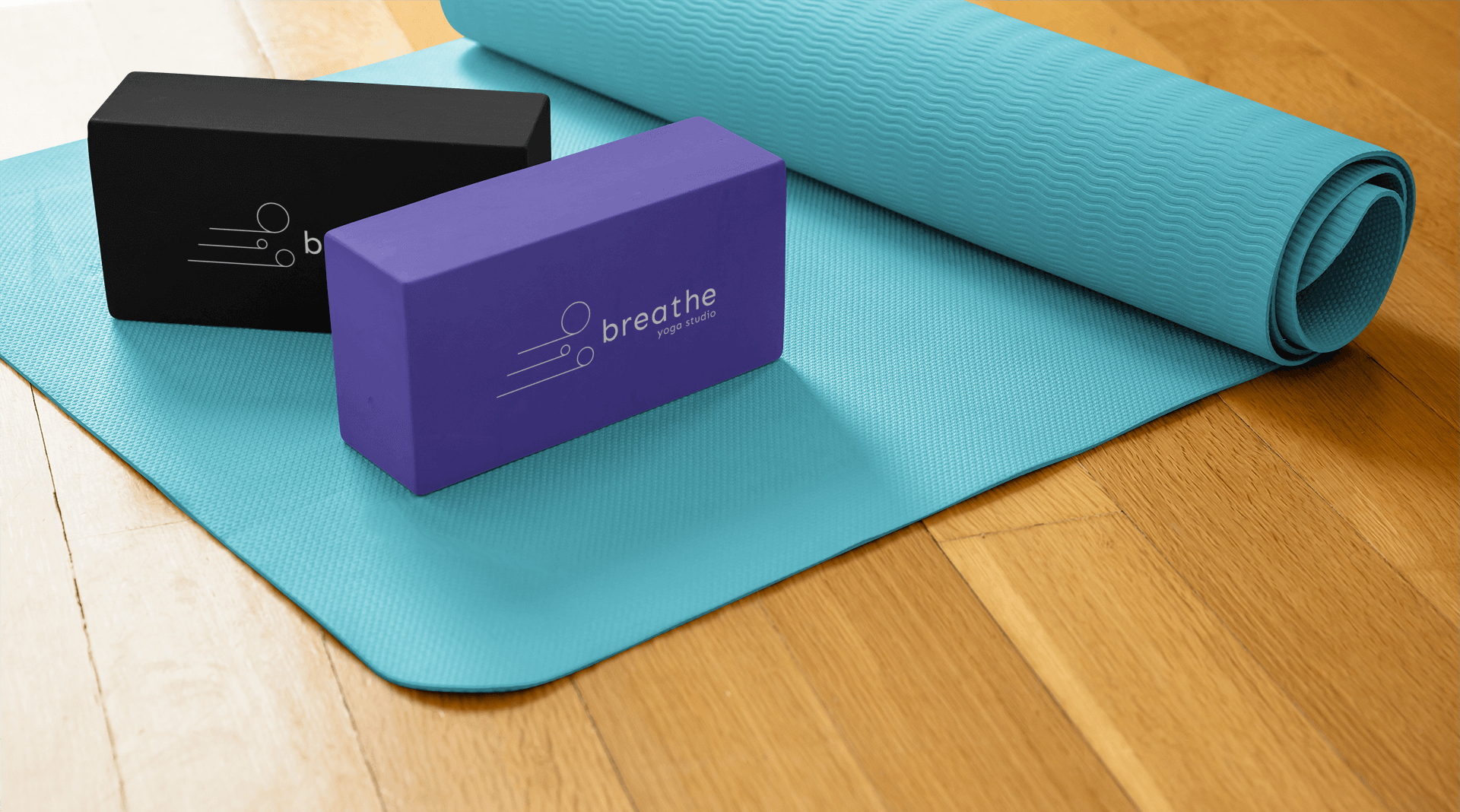
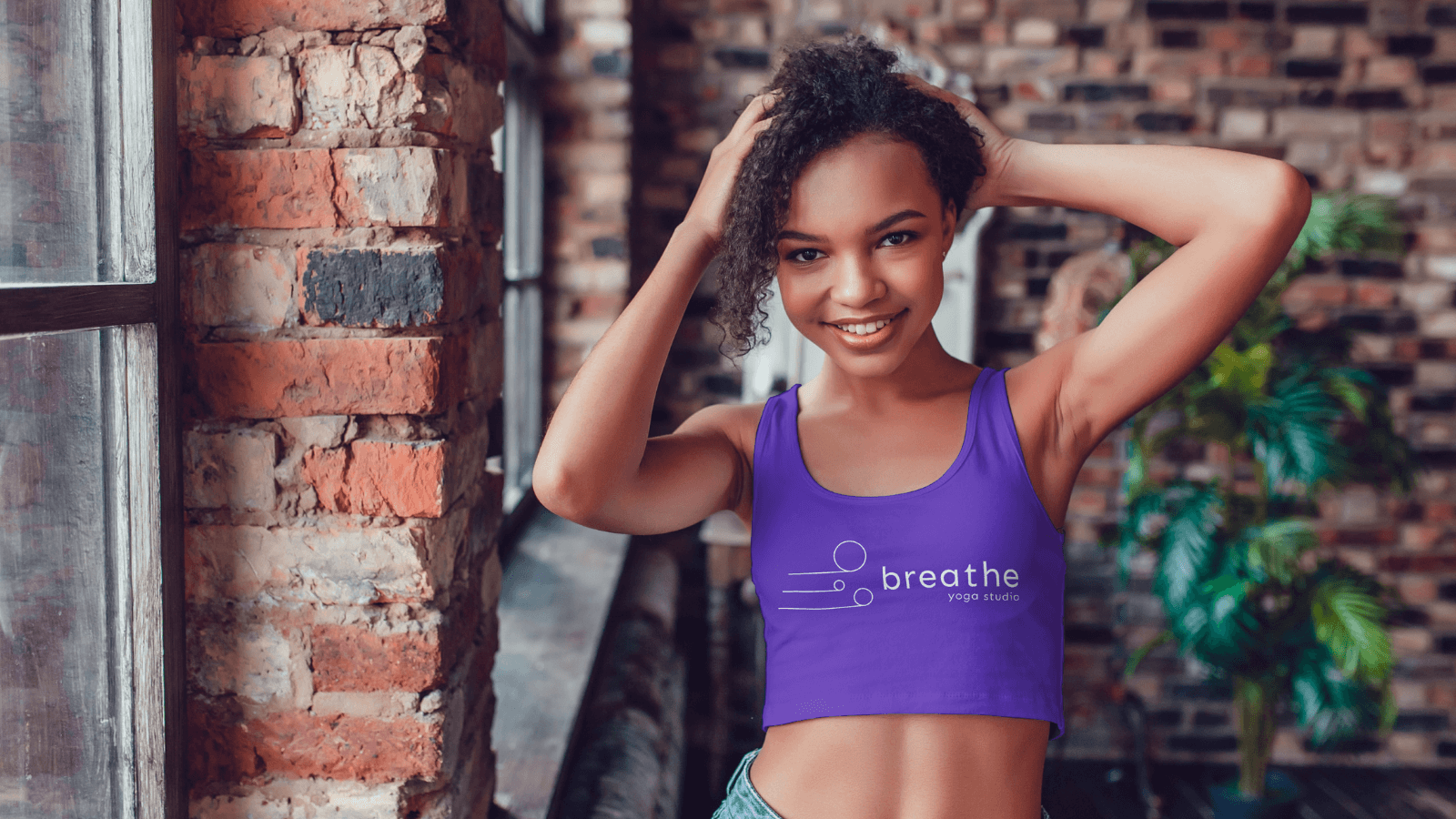
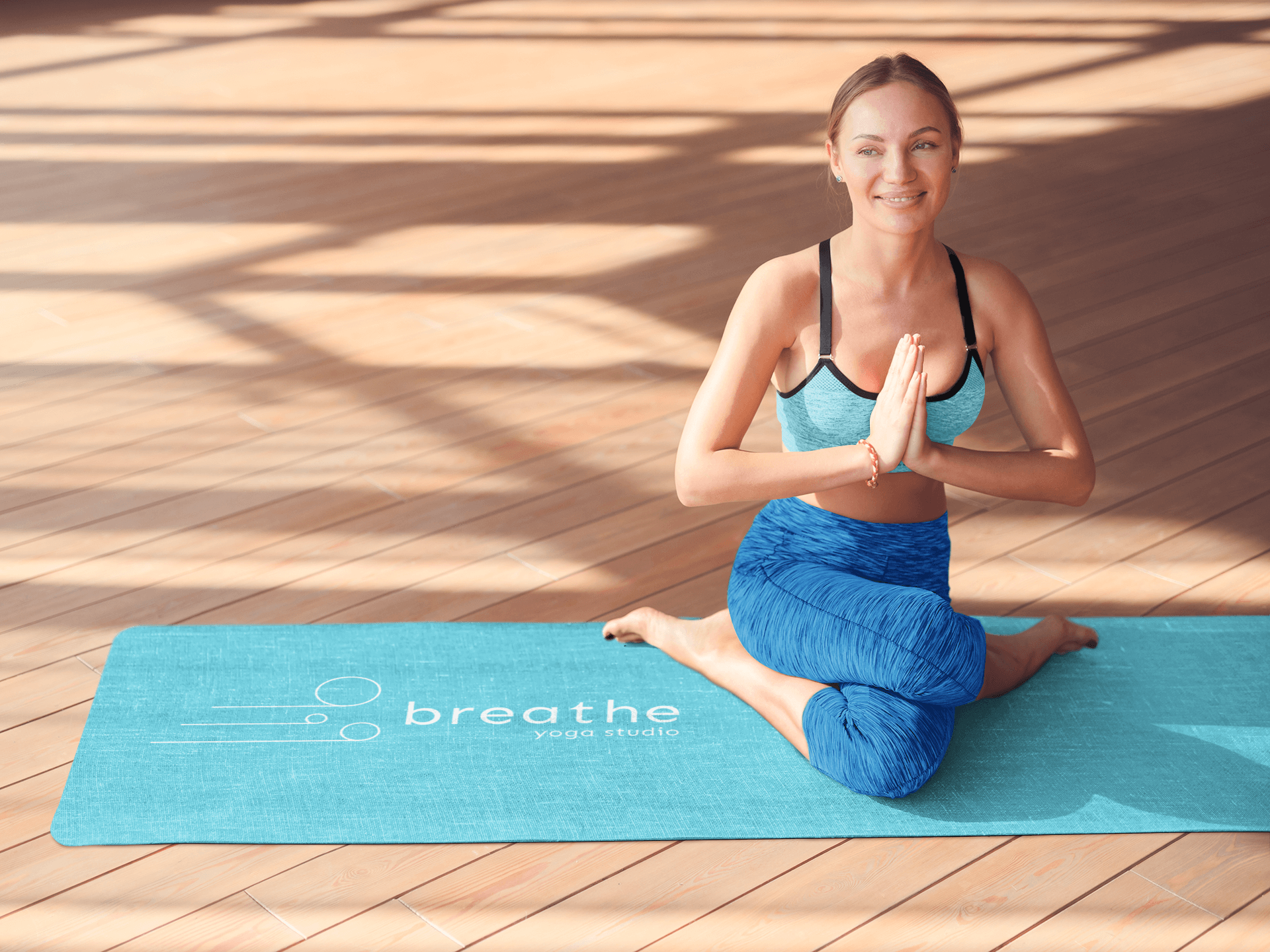
Teal, white, supporting neutrals
Teal sits between calm and clean without fully committing to either. Not the muted naturals most wellness brands reach for, not so saturated it reads as corporate. Specific enough to own. Consistent enough to carry across every surface the brand touches.
CHARACTER
Calm, purposeful, accessible
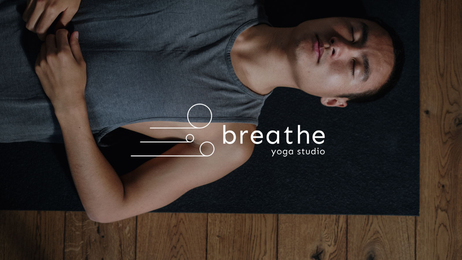
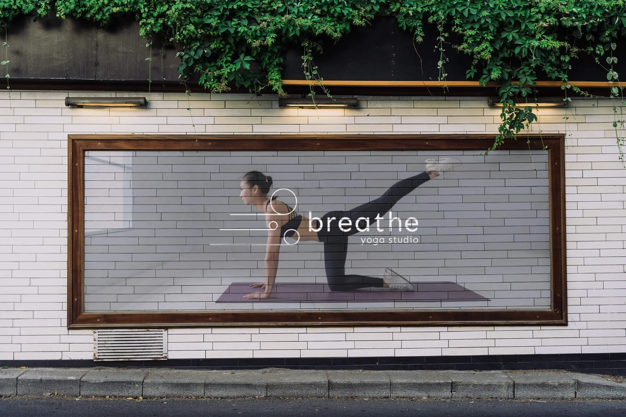
The graphic mark is a minimal circle — breath rendered as geometry rather than illustration. Simple enough to read on first contact. Considered enough to reward a second look.
§ 04
Application.
§ 05 - OUTCOME
What it became.
The identity reads as calm without reaching for the familiar signals. The teal carries the brand across every format — card, tote, billboard — with the same character in each.
The mark works for two different people in the same room: someone's first class and a practitioner who's been coming for years. Legible on first contact. Considered enough to hold on the second.
Breathe doesn't look like a yoga studio. It looks like a studio that takes yoga seriously. That's the distinction the brand was built to make.
§ RELATED
More work.
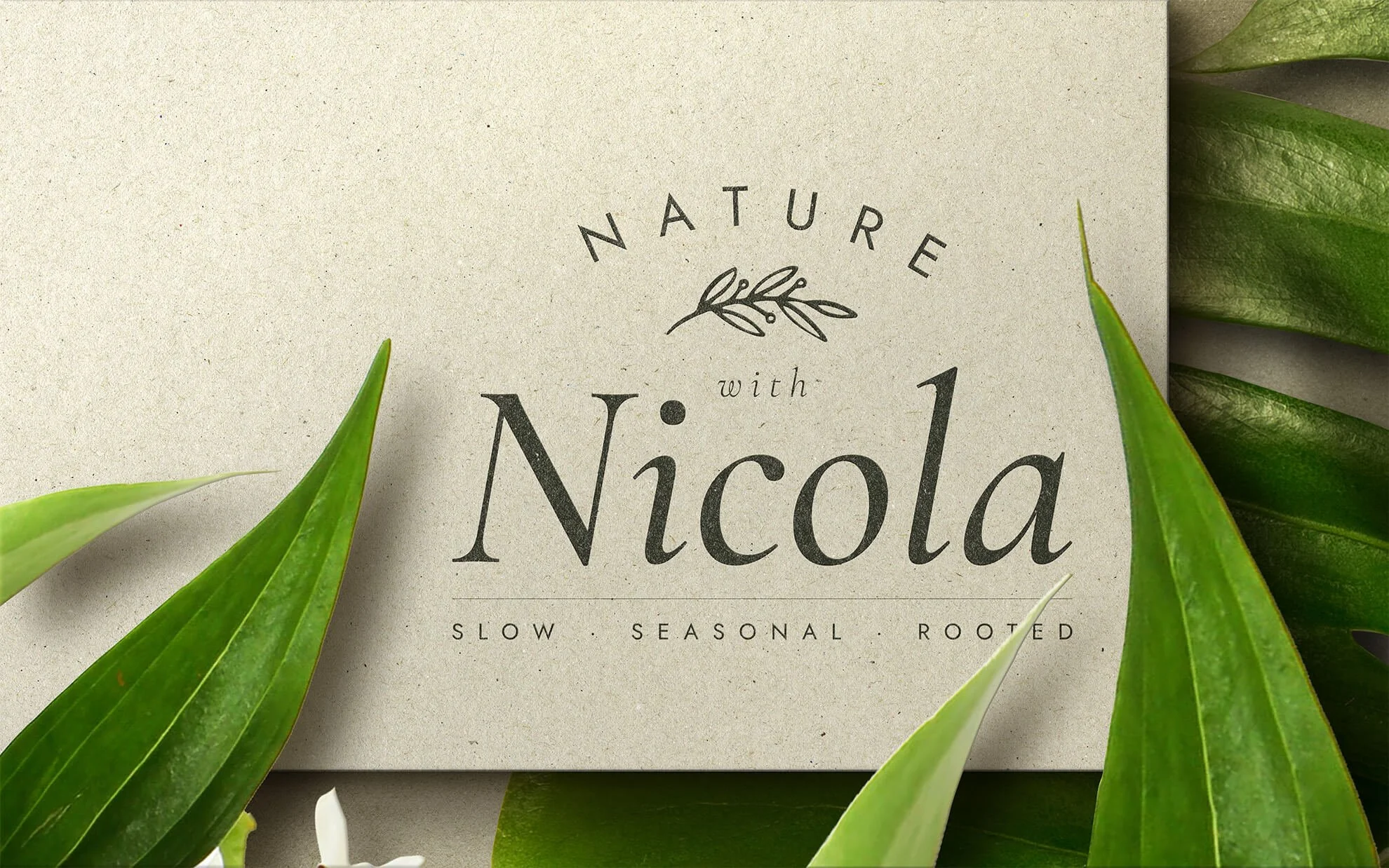
Nature with Nicola
IDENTITY & STRATEGY, WEB DESIGN
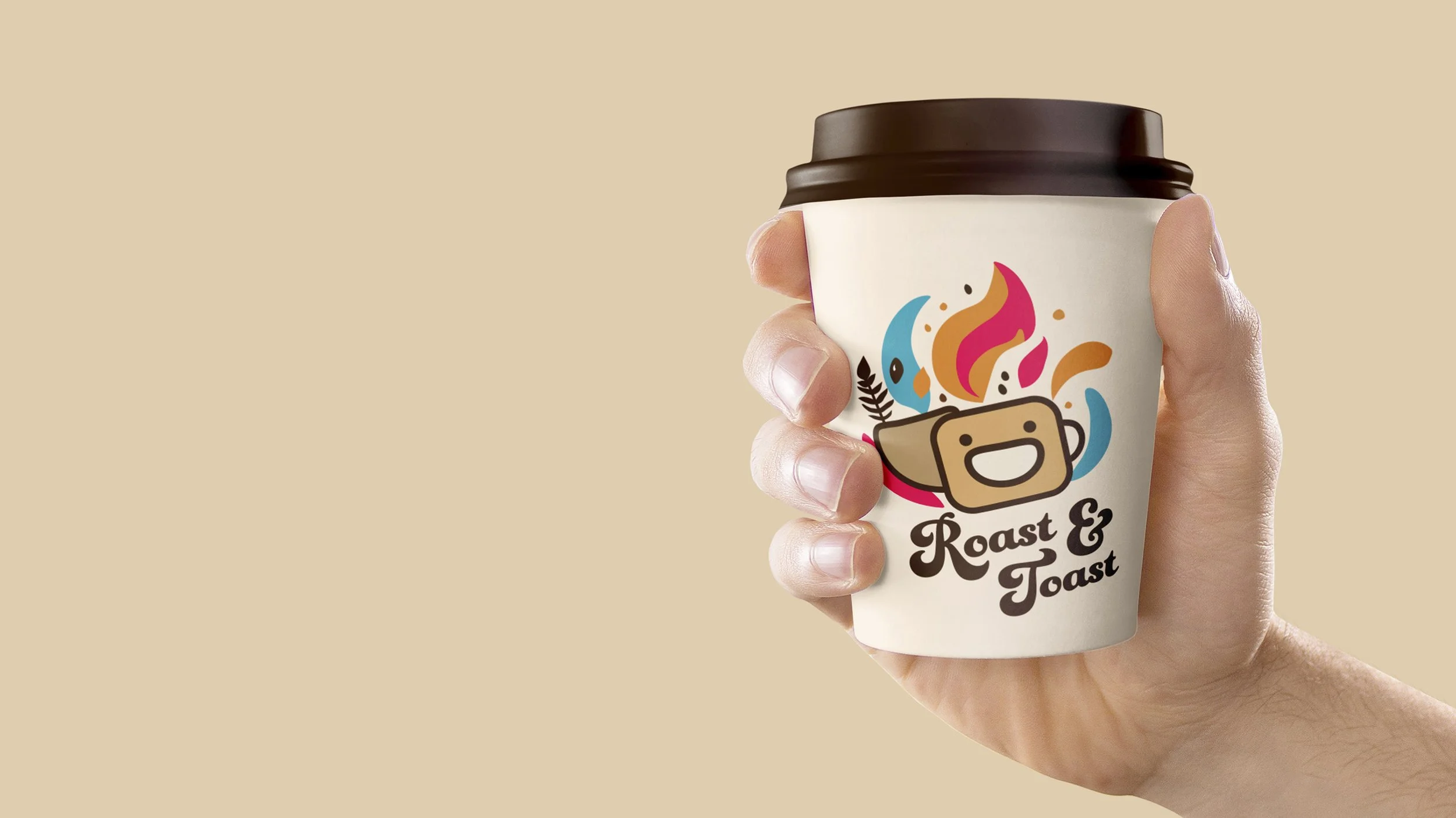
Roast & Toast
IDENTITY
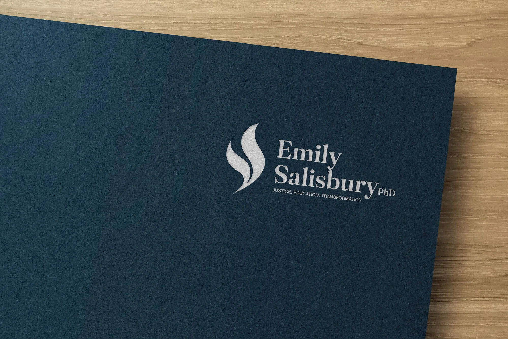
Emily Salisbury
IDENTITY & STRATEGY, WEB DESIGN