§ PROJECT · BRAND IDENTITY
Roast & Toast.
§ 01
Project overview.
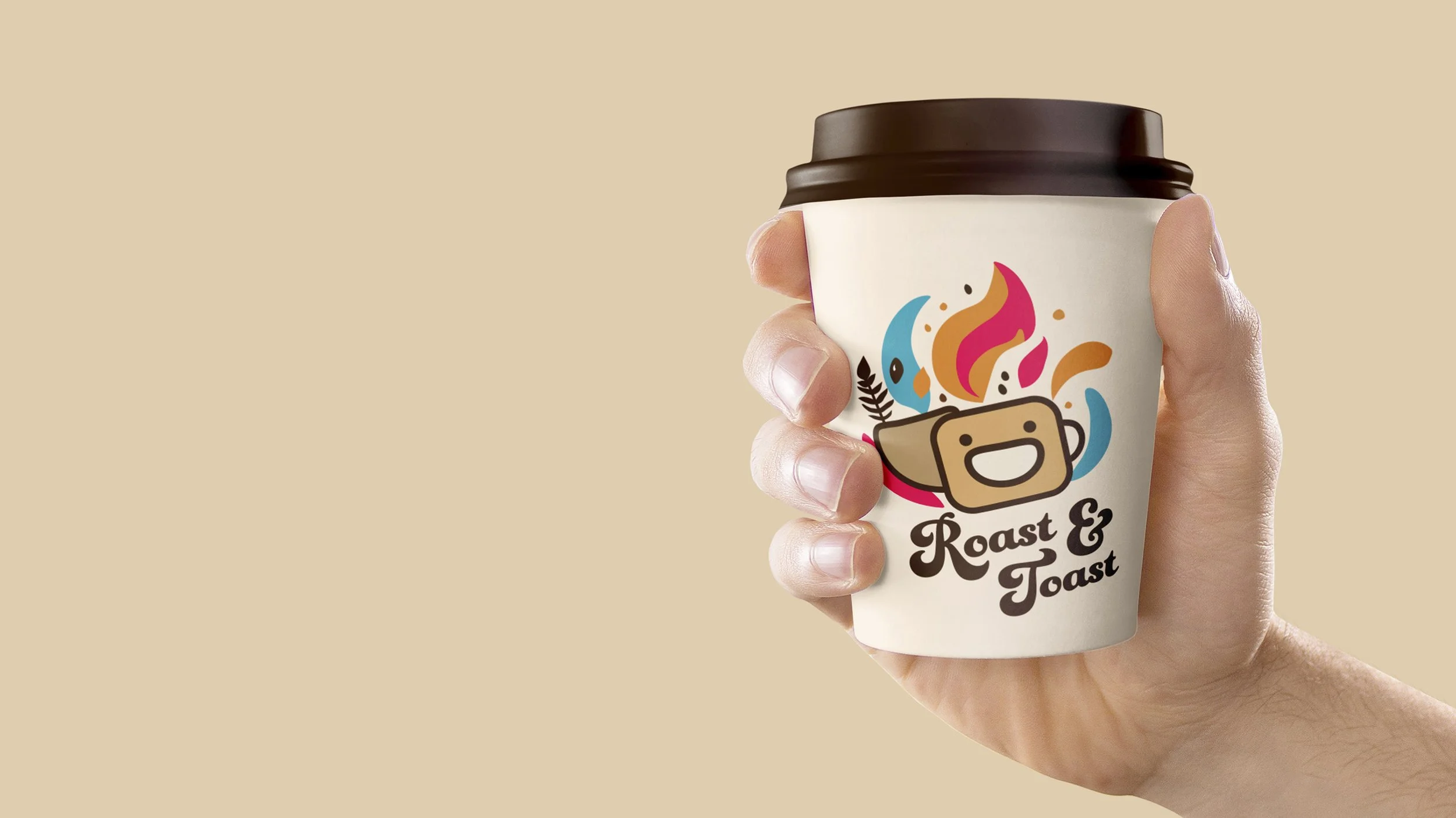
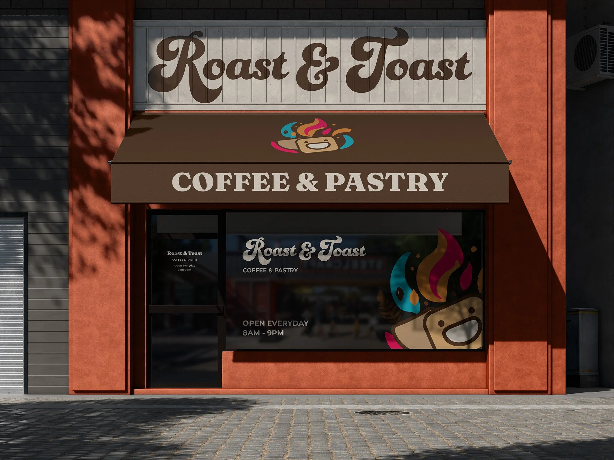
Roast and Toast Coffee is a brand identity design for an upbeat and modern coffee house. With a funky logo featuring an illustration of a coffee cup shaped like a happy slice of toast, Roast and Toast Coffee aims to create a unique and vibrant coffee house experience.
§ 02
Objective.
Build a logomark with genuine warmth — illustrative without becoming twee or sentimental
Create a system flexible enough to live on packaging, signage, apparel, and digital touchpoints without losing character at any scale
Hold the line between playful and considered — treat joy as a brand pillar, not a gimmick
§ 03
Identity.
TYPOGRAPHY
Display script paired with grotesque support
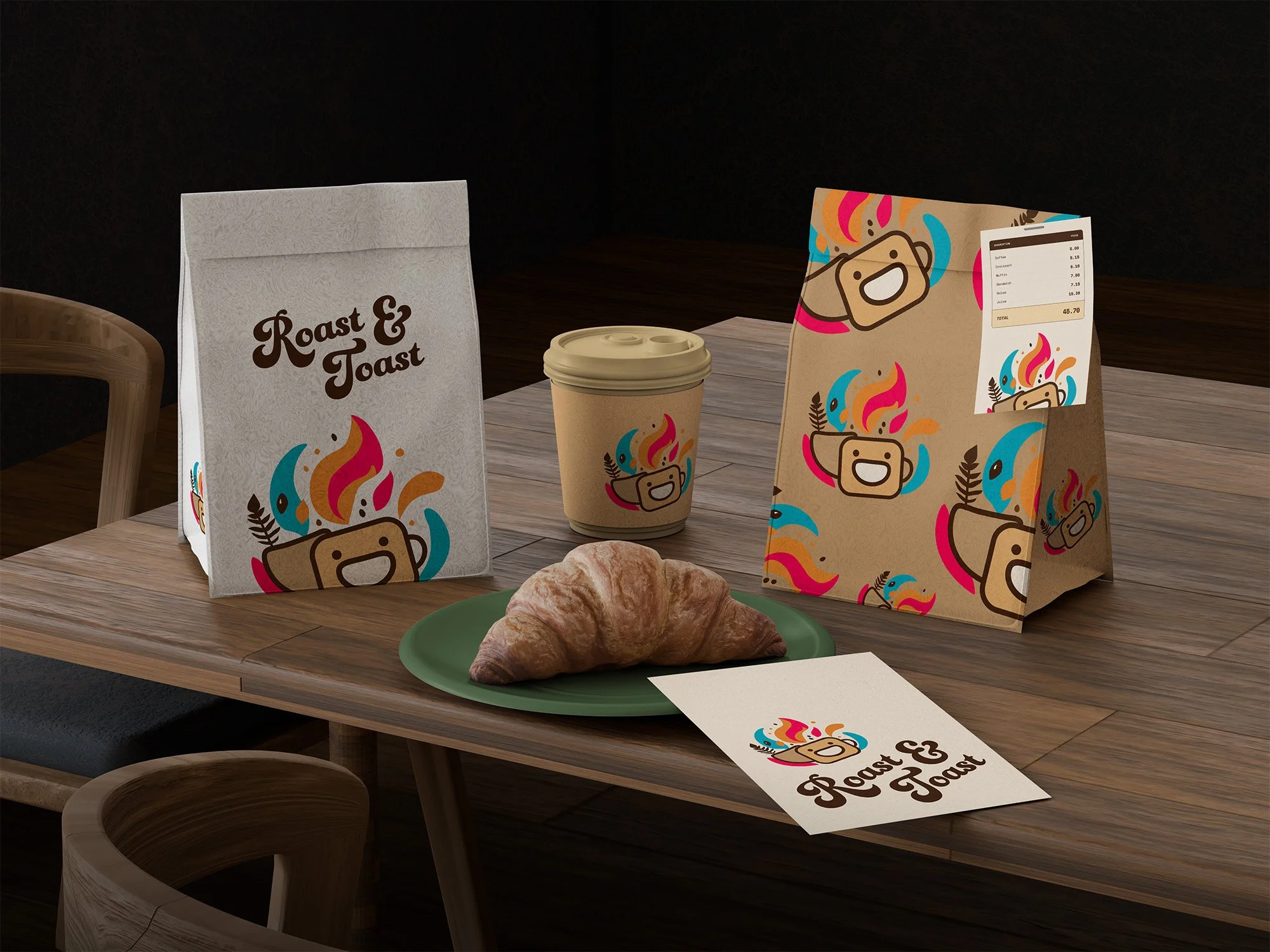
Hand-feel script for the wordmark, structural sans for body and descriptors. Warmth held at the display level; discipline applied to everything else.
PALETTE
Warm browns, cream, terracotta accents
Coffee-grounded earth tones with a single warm accent. No saturated brights, no wellness pastels. Reads as bakery, not boutique.
CHARACTER
Hand-drawn, playful, considered
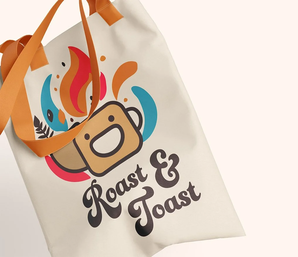
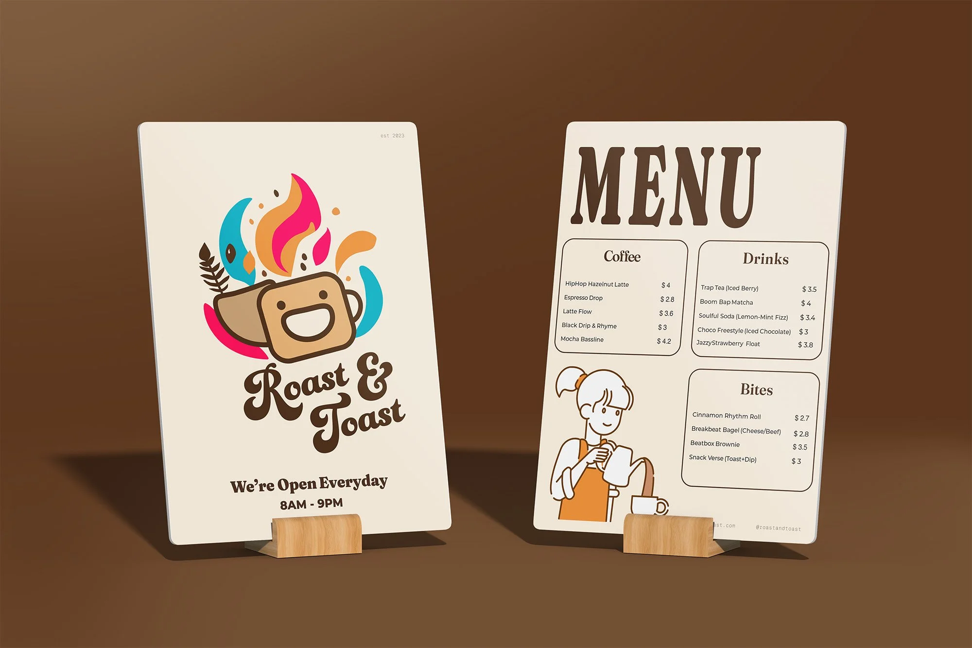
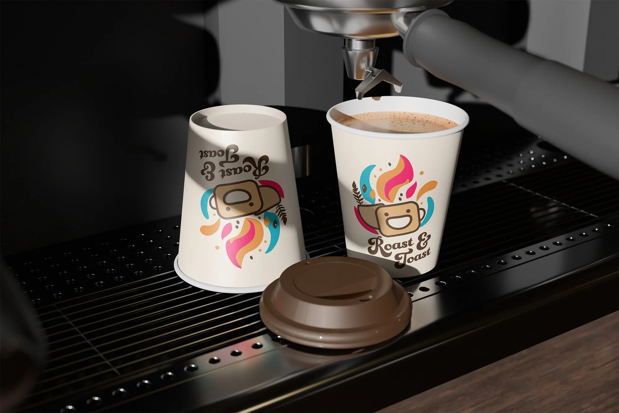
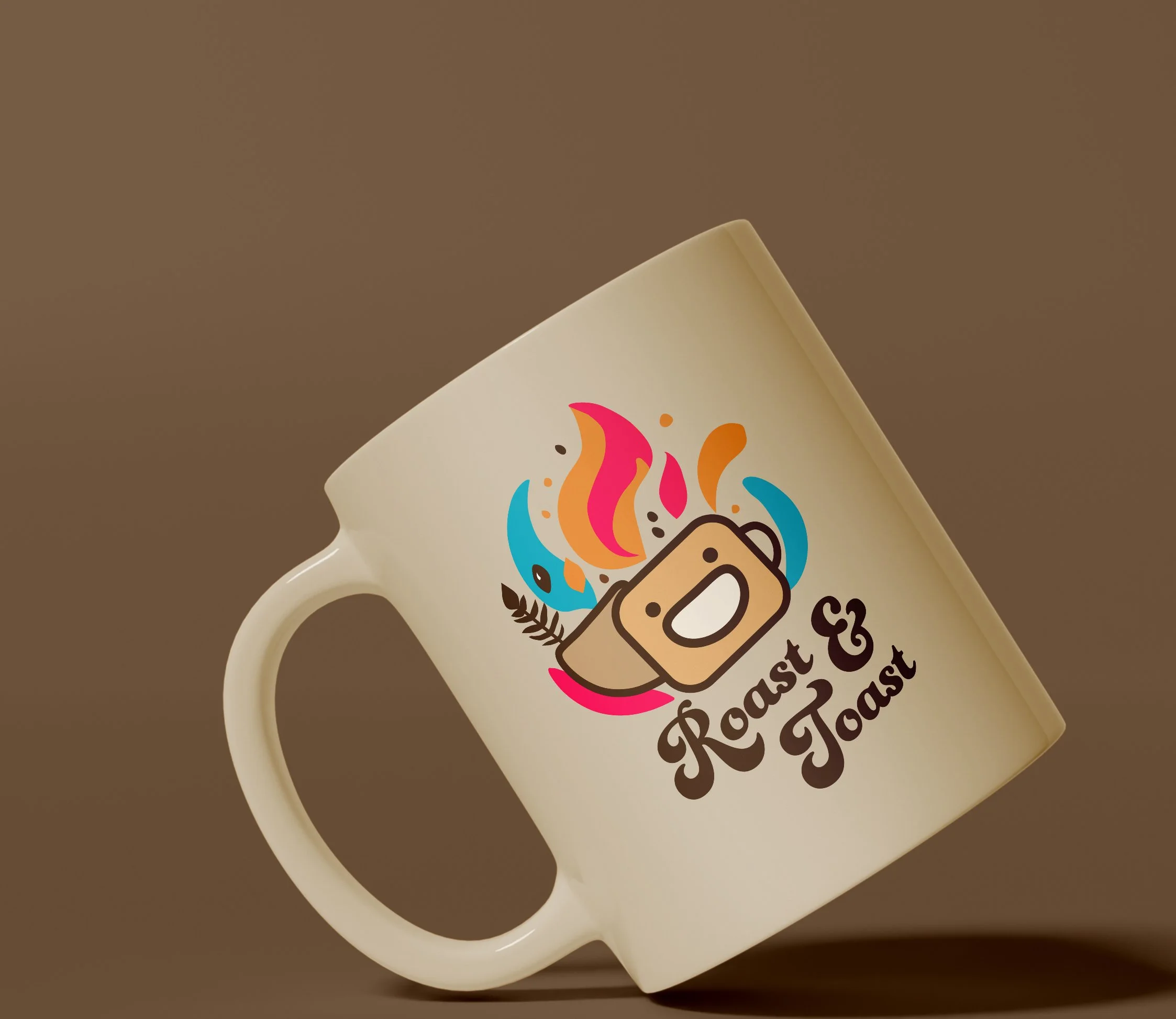
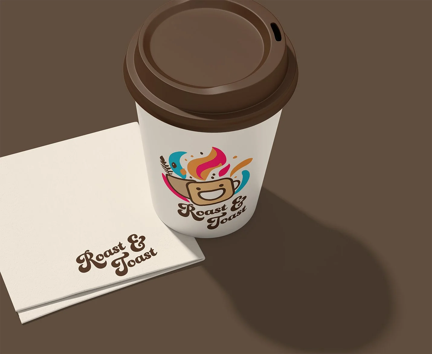
The mark itself is illustrative. A stylized coffee cup with a smiling slice of toast. Joy as the differentiator, but disciplined construction underneath.
§ 04
Application.

§ 05 - OUTCOME
What it became.
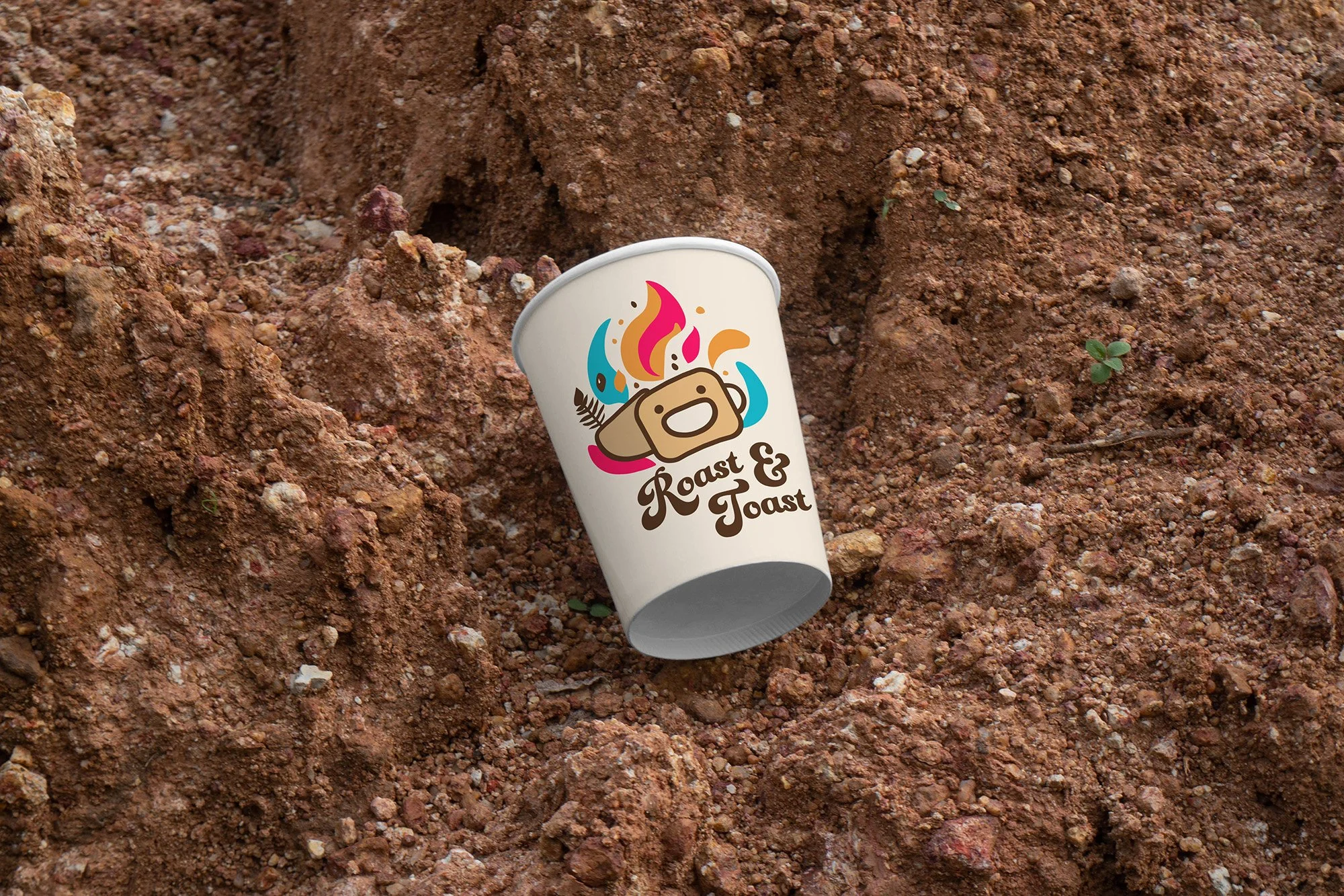
The identity holds character at scale. The hand-rendered mark survives the jump from cup to storefront without losing definition, and the supporting typography keeps the system disciplined where the mark gets playful.
The work argues for a register the hospitality category mostly avoids — joy as a brand pillar, hand-feel as a differentiator, illustration that earns its place through specificity rather than charm.
Most coffee brands reach for restraint as safety. Roast & Toast reaches for the opposite, and it holds.
§ RELATED
More work.
Elevated Ethos
IDENTITY & STRATEGY · WEB DESIGN
Emily Salisbury
IDENTITY & STRATEGY · WEB DESIGN
Nature with Nicola
IDENTITY & STRATEGY · WEB DESIGN
Have a project that needs this kind of care?
Send a note and we'll work through it together. You'll receive an honest read on whether the engagement is the right fit for what you're building.