§ PROJECT · BRAND IDENTITY & STRATEGY | WEB DESIGN
Elevated Ethos.
ENGAGEMENT
Identity & Strategy, Web Design
YEAR
2022
ROLE
Creative Director
LEAD TIME
6 Weeks
SECTOR
Business Consultant
CLIENT
Leeza Zhmurkin
§ 01
Project overview.
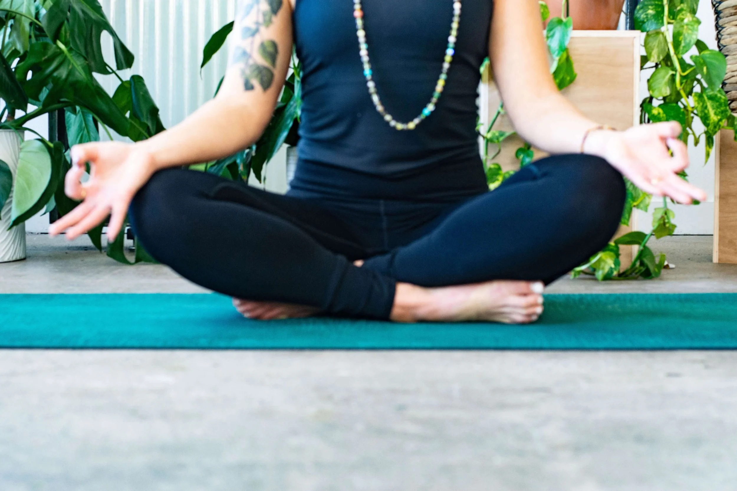
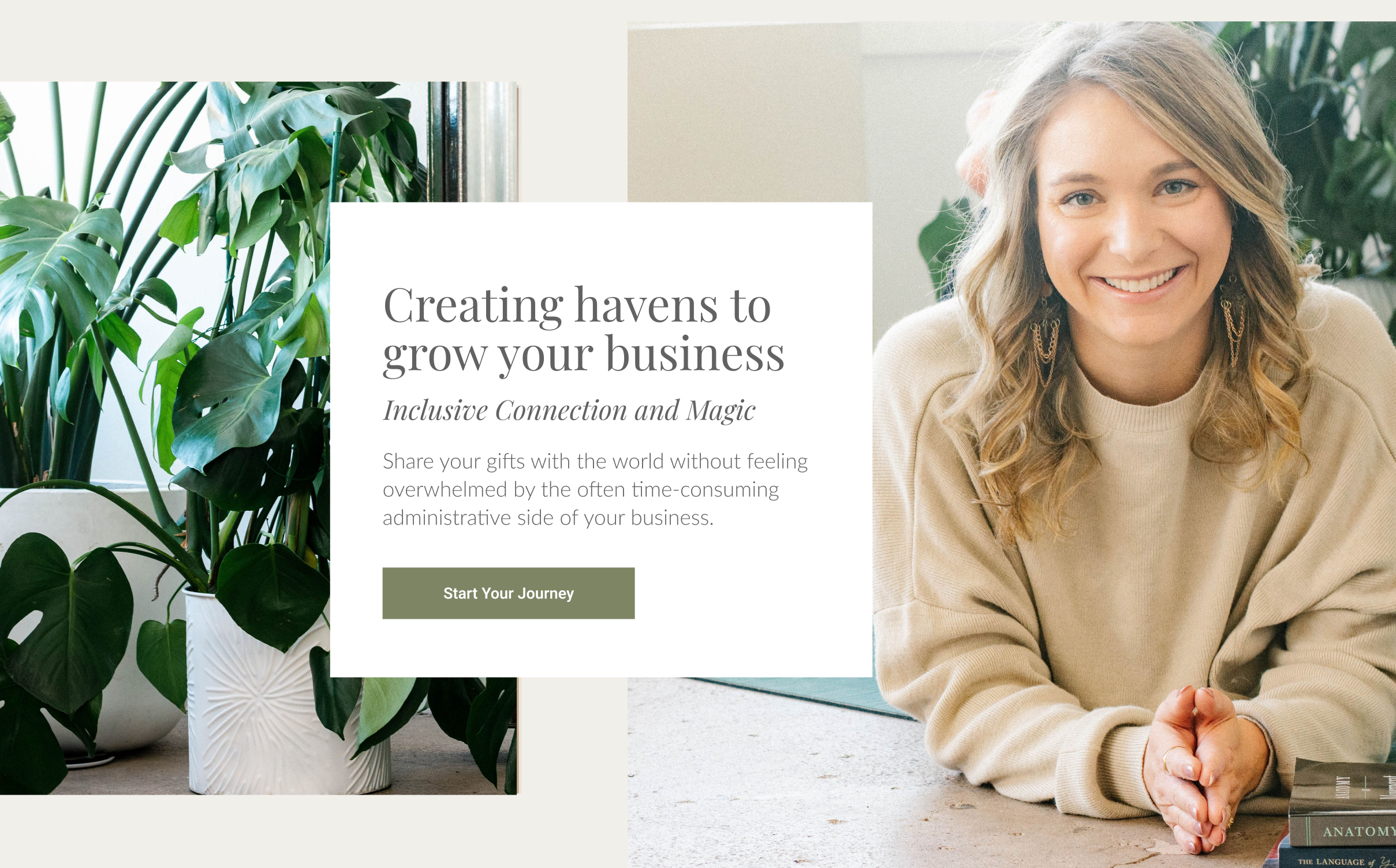
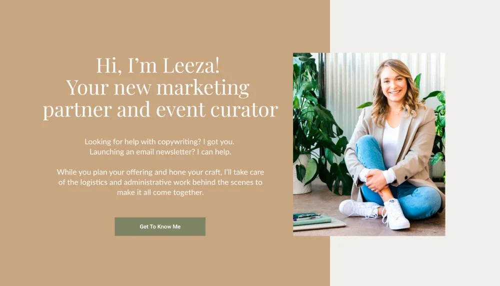
Elevated Ethos is a personal brand and website design for Leeza — a marketing strategist and certified yoga instructor whose practice bridges analytical rigor and holistic philosophy. The project required a single design system capable of holding both identities without flattening either. The resulting identity is built around the concept of sanctuary: professional enough to establish authority, warm enough to invite connection
§ 02
Objective.
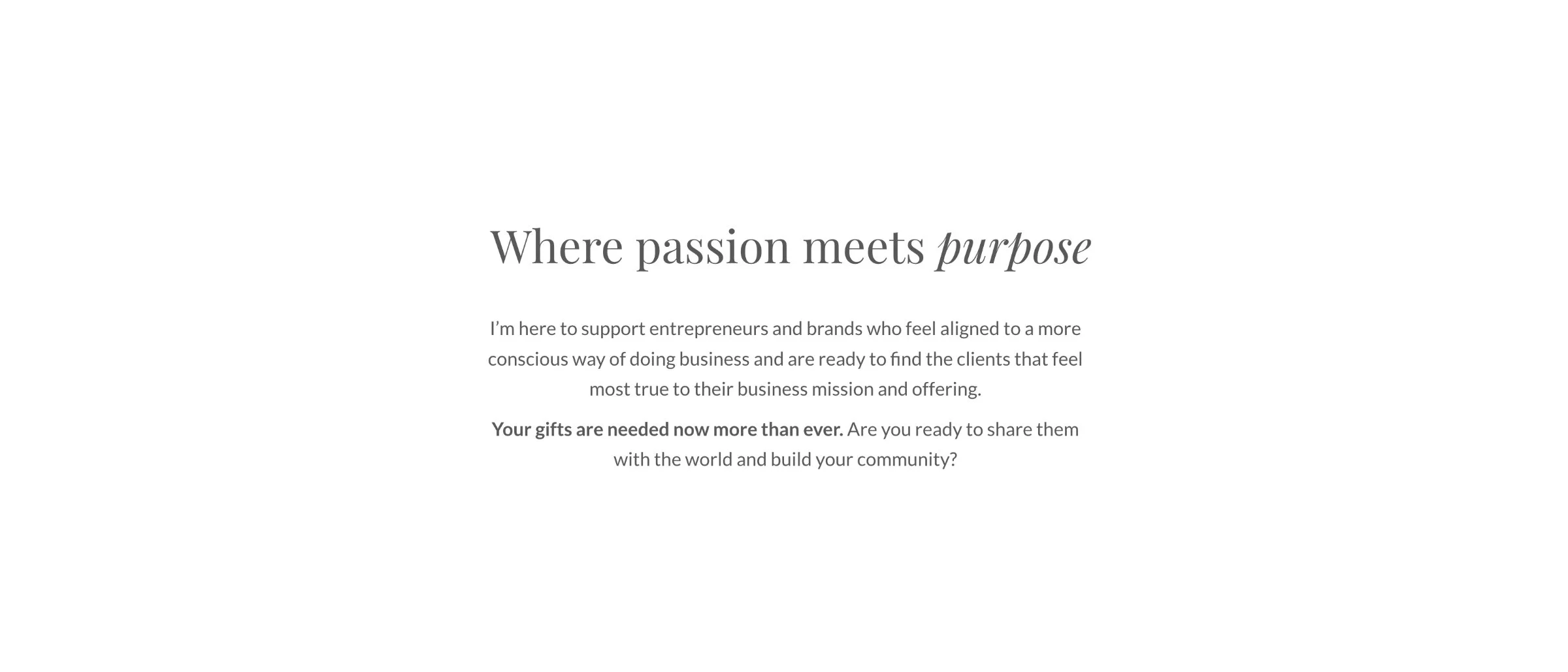
Create a unified brand identity that holds Leeza's dual expertise without contradiction
Develop a visual system that reads as refined without reading as cold
Design a website that positions Leeza as a guide, not just a service provider
§ 03
Identity & wordmark.
The logo for Elevated Ethos was developed from the name itself. The letter E was deconstructed and rebuilt as ascending steps: a structural mark that holds the logic of Leeza's practice in a single form. Each tier of the mark corresponds to a tier of her approach: layered, intentional, each level built on the one before. The geometry communicates discipline and progression. The restraint of its placement communicates the practitioner behind the work: sophisticated, professional, and patient in her methods.
§ 04
Typography.
DISPLAY · HEADLINES

Typography carries the identity's emotional register. Playfair Display anchors the hierarchy. A serif with enough editorial character to communicate sophistication without formality, it positions Leeza's practice as considered and authoritative.

TEXT · BODY
Lato completes the pairing. Where Playfair Display establishes authority, Lato delivers readability and approachability through longer passages. Headlines draw the visitor in; body copy holds them.
The combination sustains the brand's central tension: precision and warmth within the same system.
§ 05
Color palette.
The palette is built on restraint. A foundation of warm neutrals and deep earth tones creates grounded calm. Accent values introduce warmth without saturation: color that signals presence without demanding it.
The result avoids the failure mode of wellness branding, palettes so muted they disappear, or so vibrant they perform. Elevated Ethos uses color to create a room, not a feeling.
§ 06
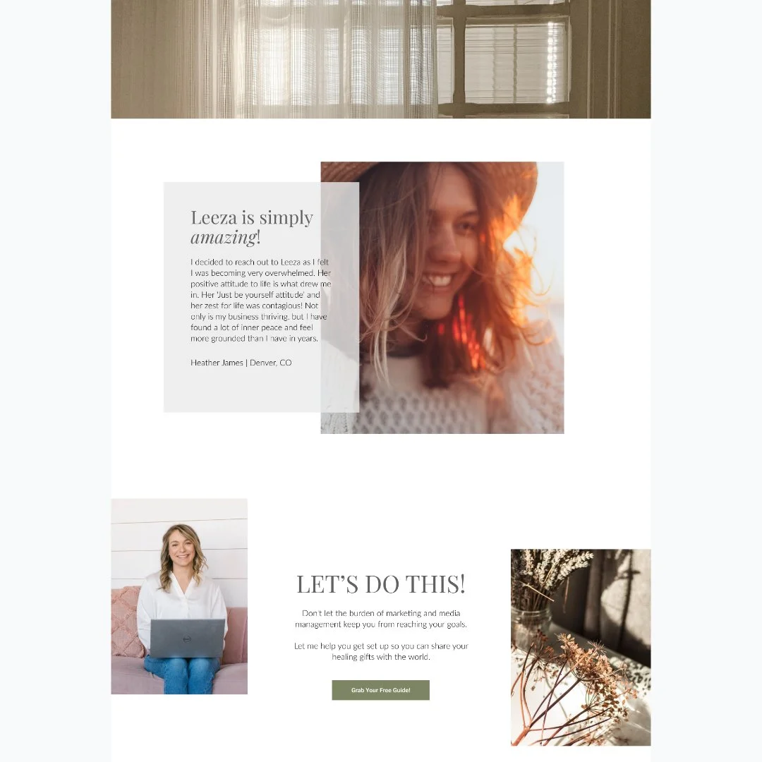
The built site.
The website functions as a guided experience. Navigation is deliberate. Content architecture moves the visitor through Leeza's expertise before the offer: credibility first, then the ask.
White space is structural. Imagery and layout work together to slow the reader down and give each section room to land before the next begins.


§ 07 - OUTCOME
What it became.
Elevated Ethos is a platform that holds both of Leeza's professional identities without compromising either. The identity reads as refined and grounded at once. The website creates the conditions for trust before the first conversation starts. A foundation built to carry her business forward.
§ RELATED
More work.
Nature with Nicola
IDENTITY & STRATEGY, WEB DESIGN
Roast & Toast
IDENTITY & STRATEGY
Emily Salisbury
IDENTITY & STRATEGY, WEB DESIGN
Have a project that needs this kind of care?
Tell me what's not working. We'll work through it together, directly, with no middle layers, and you'll receive an honest recommendation, even if it's not hiring me.