§ PROJECT · BRAND IDENTITY · PACKAGING
Danika.

§ 01
Project overview.
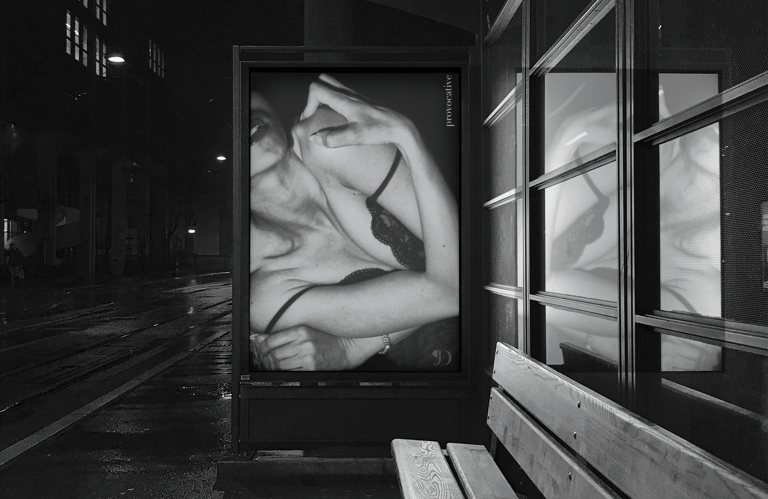
Danika is a natural fragrance brand built around all-natural ingredients. The tension in the category: brands that lead with natural sourcing tend to reach for warm, artisanal aesthetics — botanical, earthy, approachable. Danika sits at the luxury end of that market. The two positions rarely share a visual language. The project was to find one that held both.
§ 02
Objective.
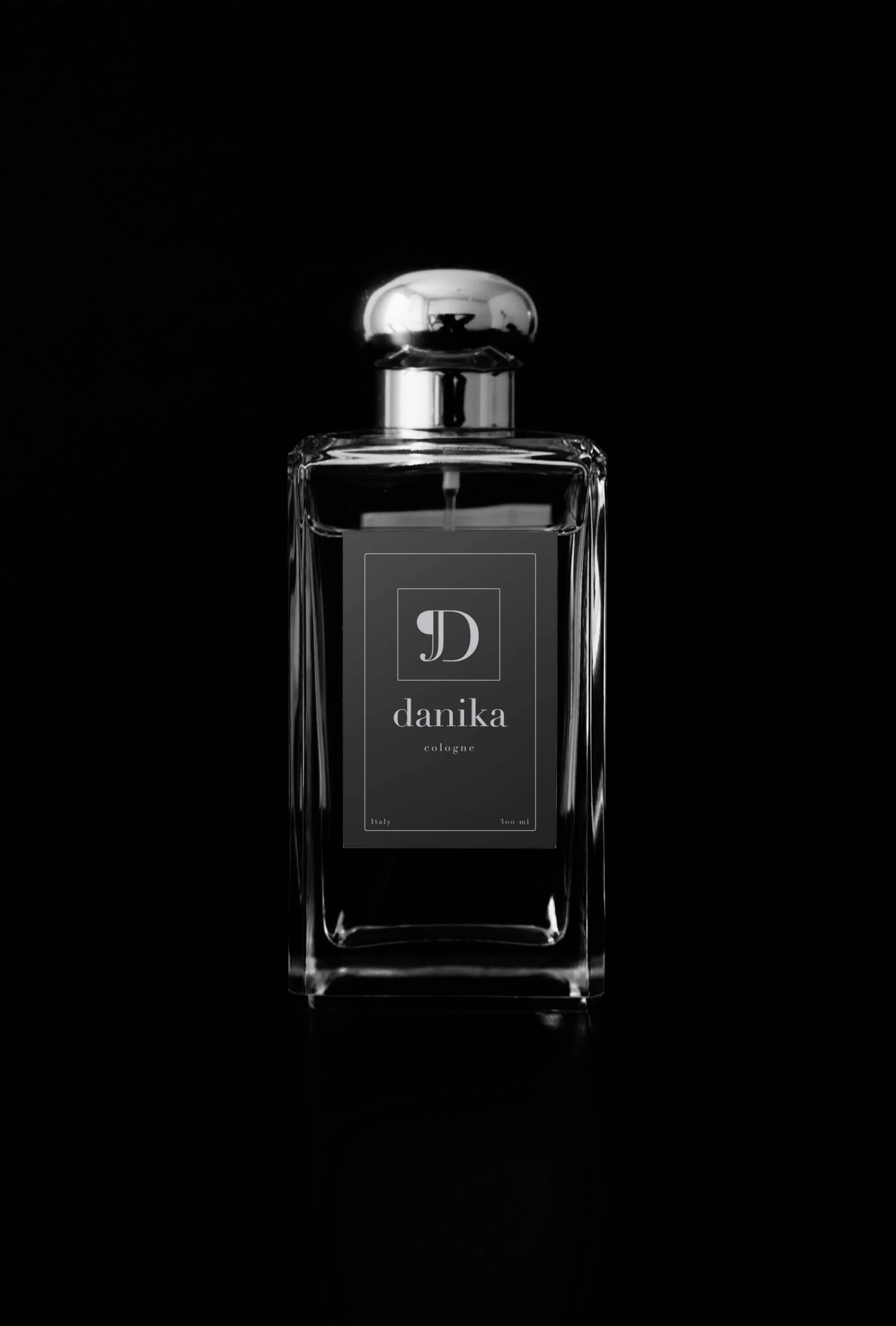
Build a mark from the brand's primary typeface that works at bottle-label scale and at full-page editorial size — one letterform, no simplified variant
Create a palette system that positions the brand as luxury through exclusion: no warm tones, no pastoral signals from the natural-ingredients category
Establish a visual language that communicates sensuality and precision without reaching for the vocabulary fragrance advertising has made routine
§ 03
Identity.
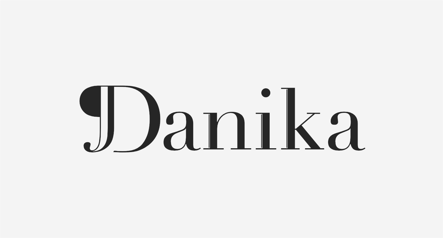
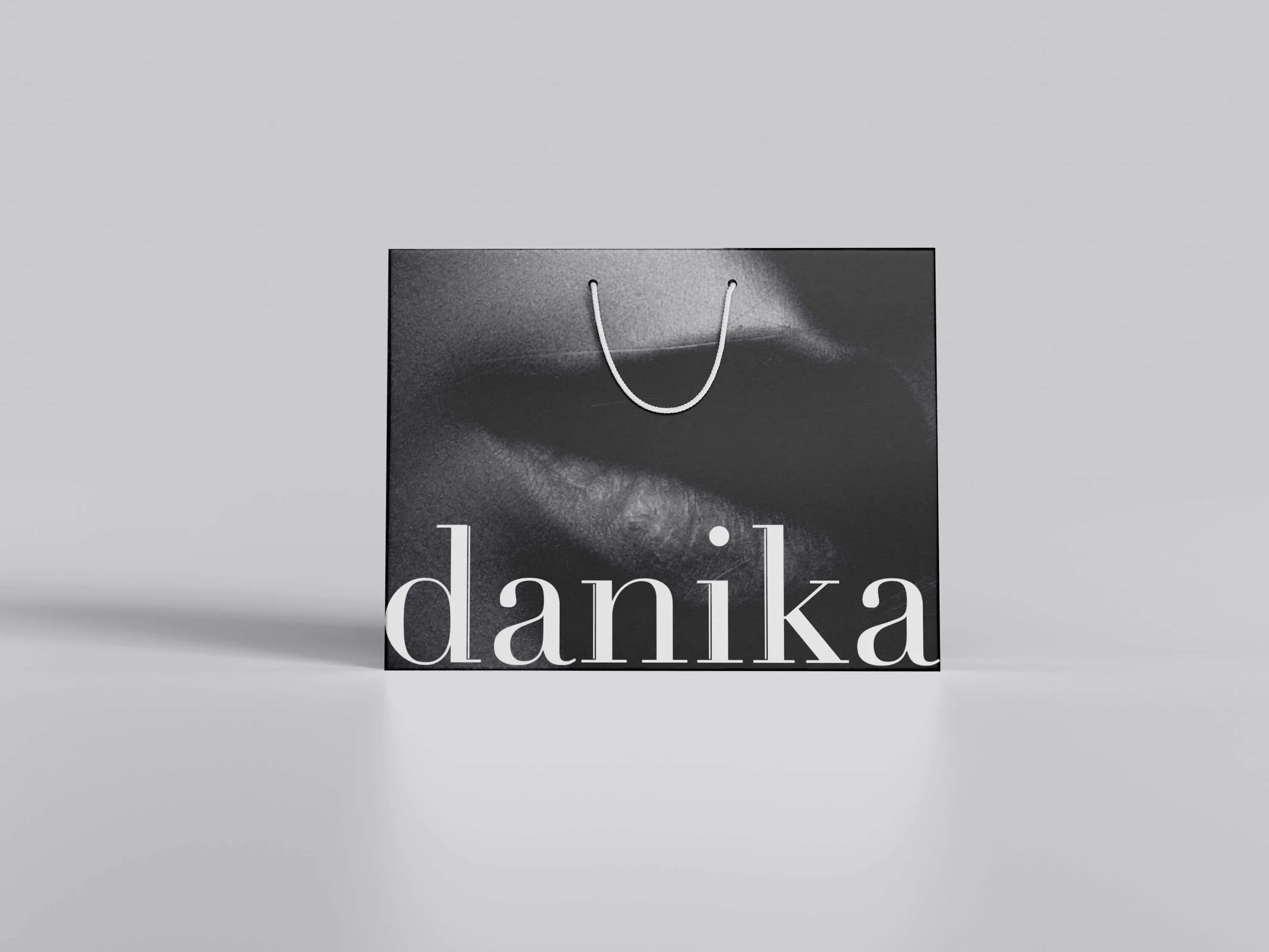
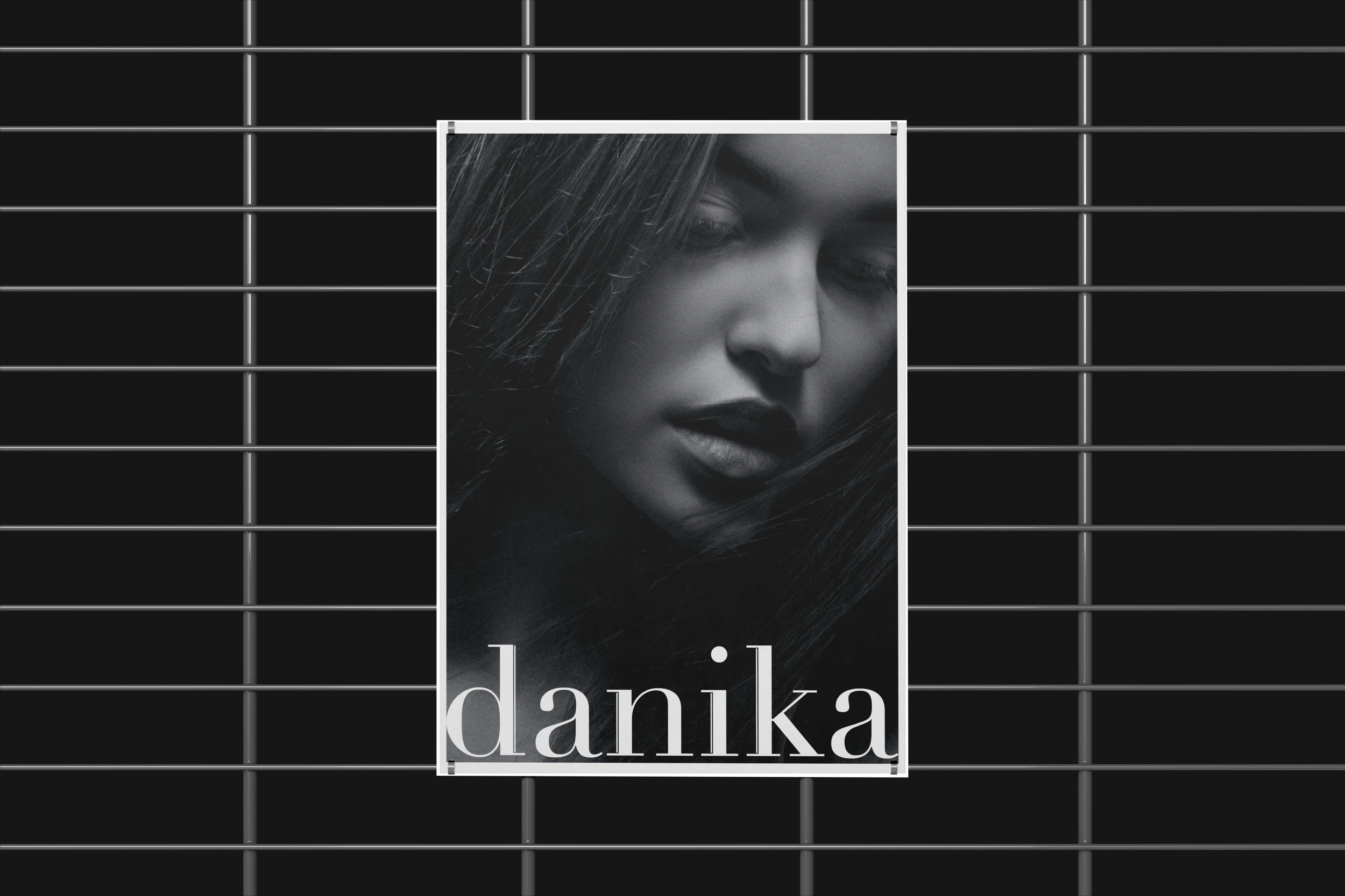
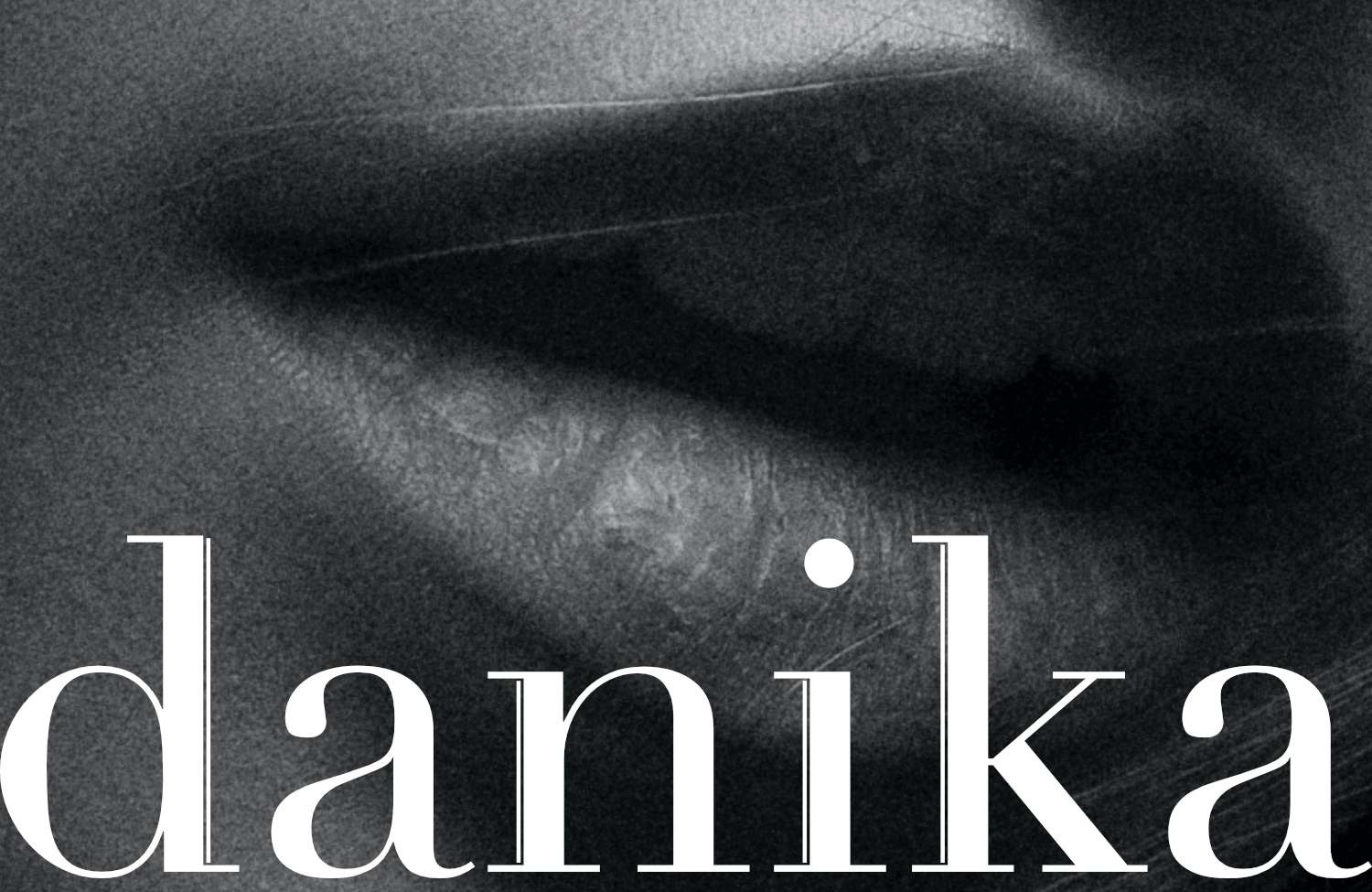
TYPOGRAPHY
Wordmark and mark as one intention
The letterform is the logo. The D is drawn from the brand's primary typeface rather than constructed as a separate graphic element. One decision carries both functions.
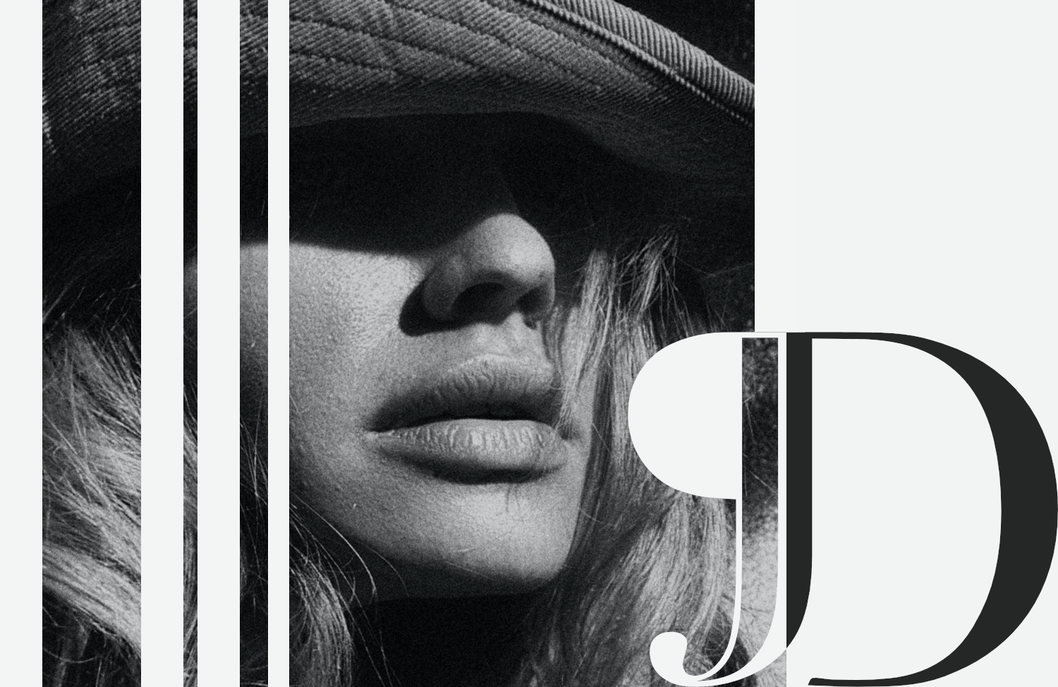
PALETTE
Monochrome — black, white, no exceptions
No warm tones, no translucency effects, no gradient. The palette signals luxury through what it excludes. Every competing fragrance brand reaches for gold or glass. This one reaches for neither.
CHARACTER
Precise, restrained, sovereign
The identity doesn't announce itself. The monogram reads as premium because it doesn't try to convince anyone it is. That restraint is the positioning — not a style applied over it.
§ 04
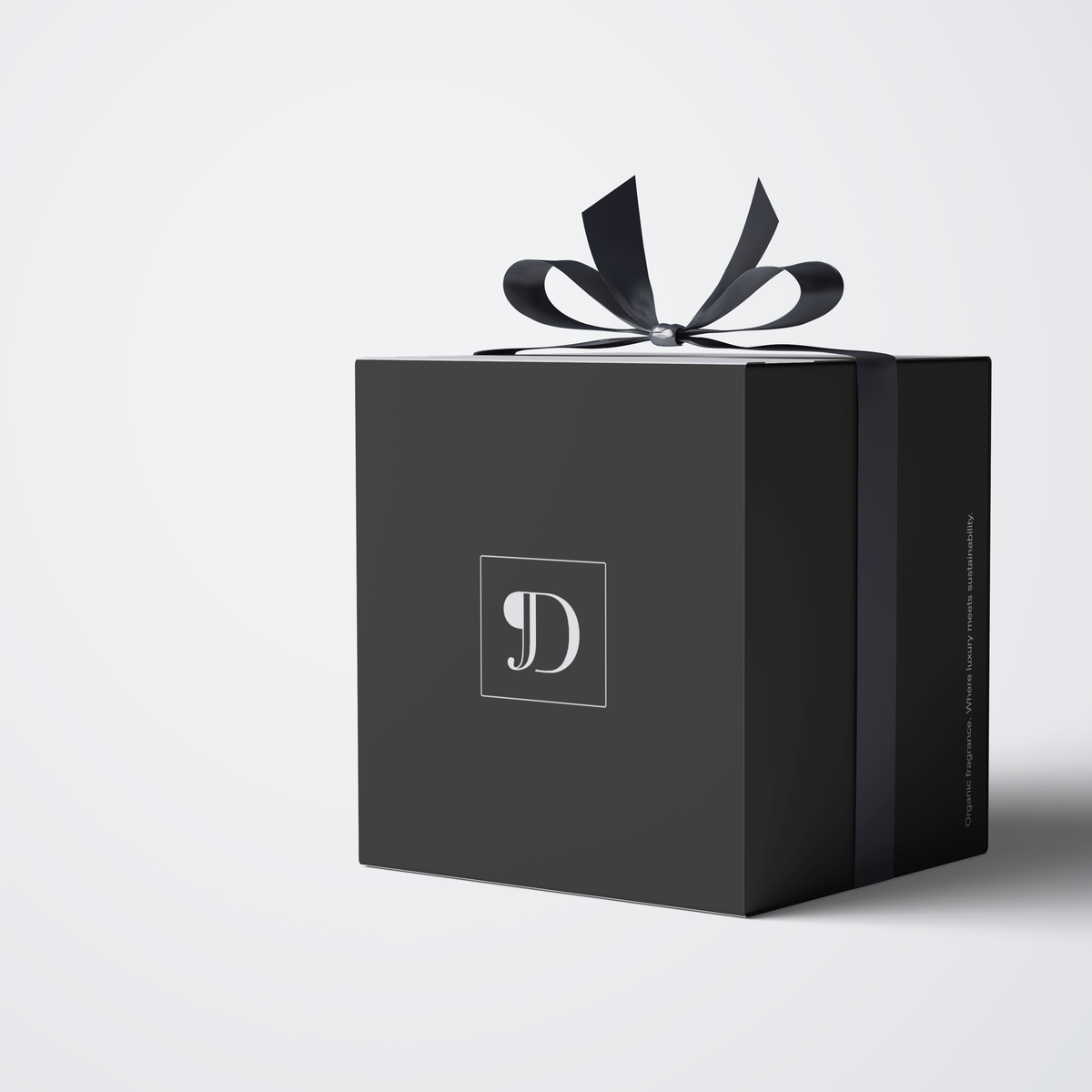
Application.
§ 05 - OUTCOME
What it became.
The Didot D on a bottle label communicates what a full typographic wordmark would, with less surface area to work with. The system proves its own argument: restraint as positioning, not decoration.
The visual identity operates on a different register. One where the audience doesn't need to be told the brand is premium, because nothing in the system suggests otherwise.
Most fragrance brands reach for ornament as proof of luxury. Danika reaches for the absence of it.
§ RELATED
More work.
Nature with Nicola
IDENTITY & STRATEGY, WEB DESIGN

Roast & Toast
IDENTITY
Emily Salisbury
IDENTITY & STRATEGY, WEB DESIGN