§ PROJECT · BRAND IDENTITY · PACKAGING
Zesti.
§ 01
Project overview.
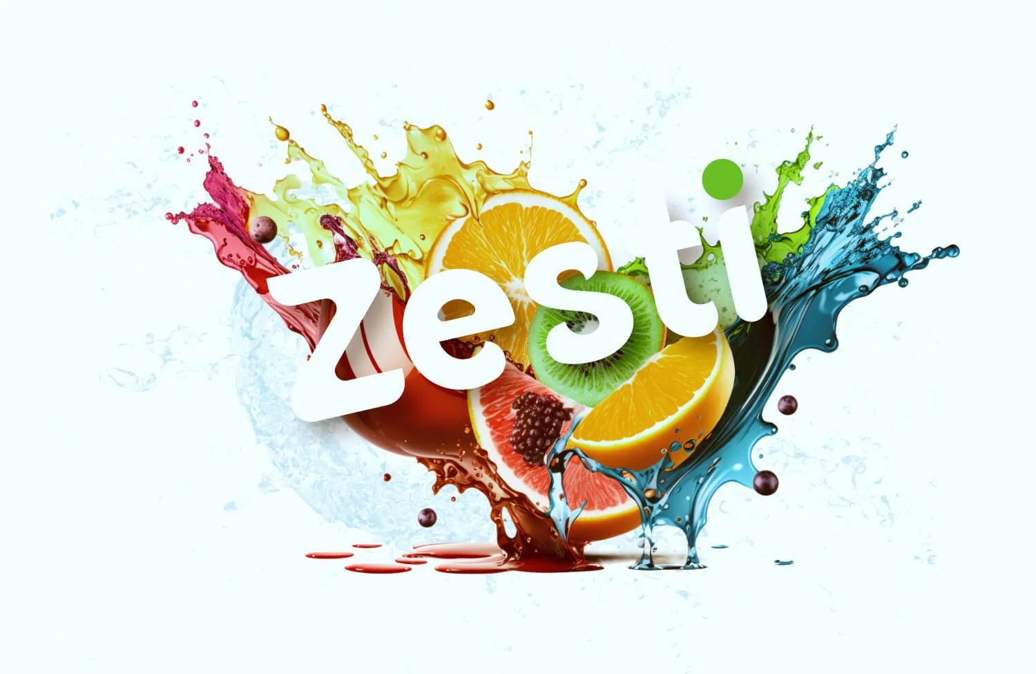
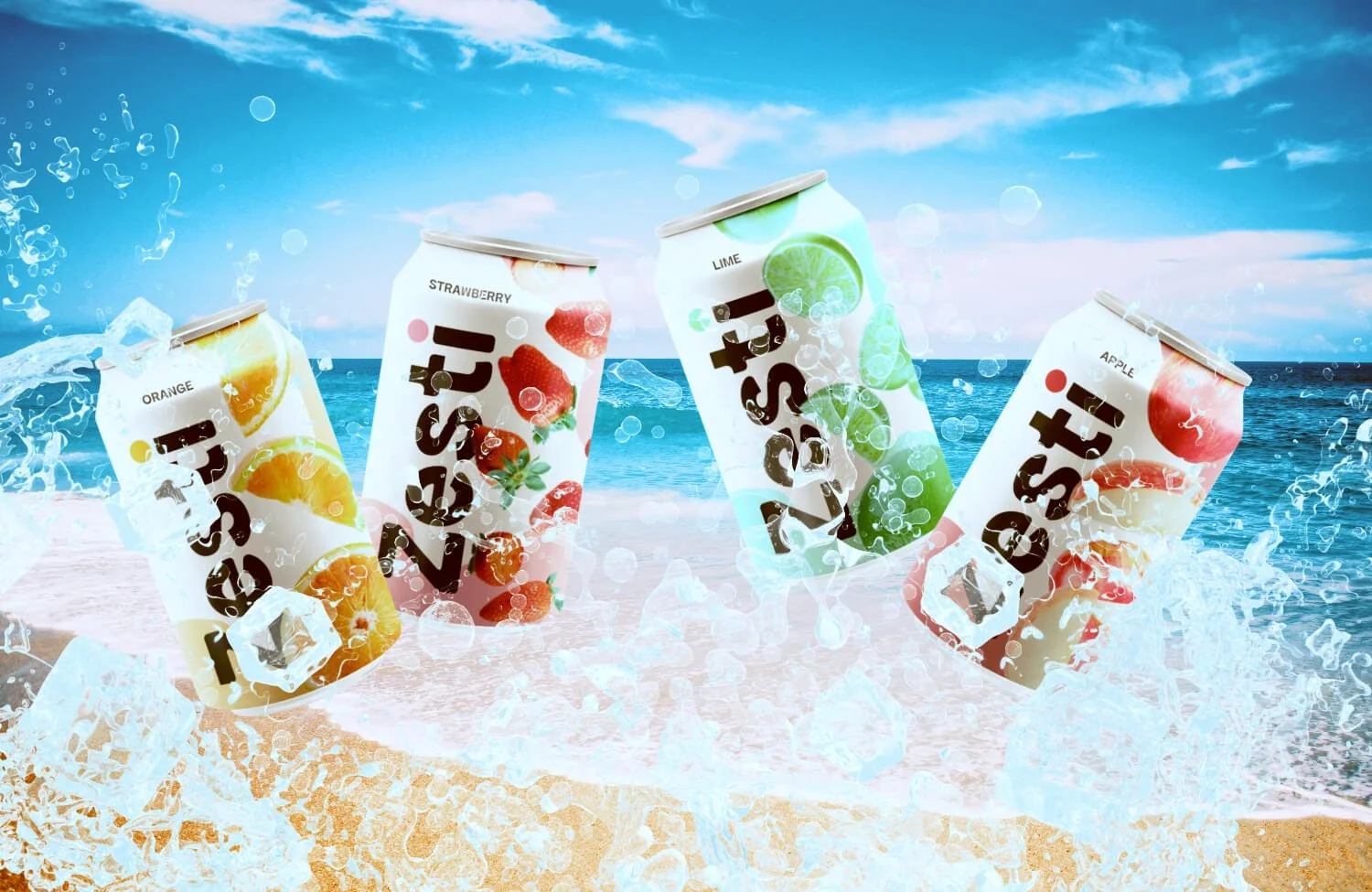
Zesti is an all-natural fruit drink with five flavors, each built around real fruit. The challenge in the category: most natural drink brands signal purity through restraint — clean white space, muted tones, minimal illustration. Zesti moved in a different direction. Bold color per flavor, fruit imagery at full volume, a logotype with throwback energy. The work was to make that boldness feel deliberate rather than loud.
§ 02
Objective.
Design a logotype with enough character to anchor five distinct color systems without becoming a different mark on each can
Build a per-flavor identity — individual color palette, fruit illustration, and accent detail — that reads as a coherent family at shelf scale
Land in the territory between energetic and considered: a brand that reads as direct and vivid, with a retro edge that comes from the design itself
§ 03
Identity.
TYPOGRAPHY
Customized round sans — airy, weighted for can scale
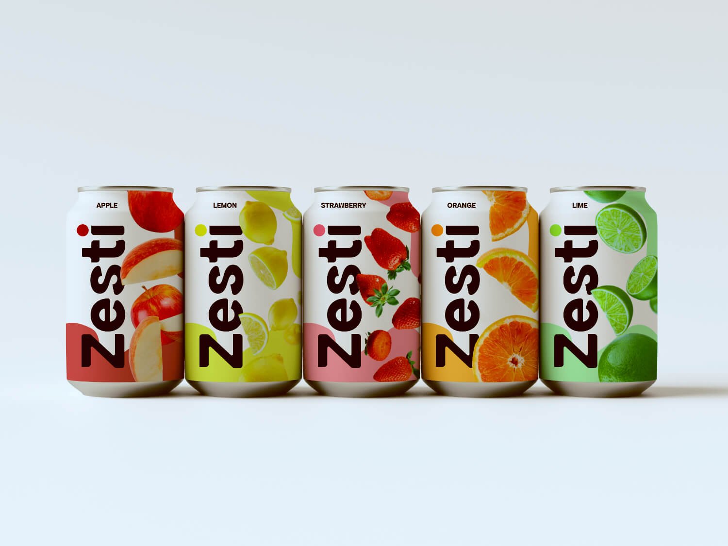
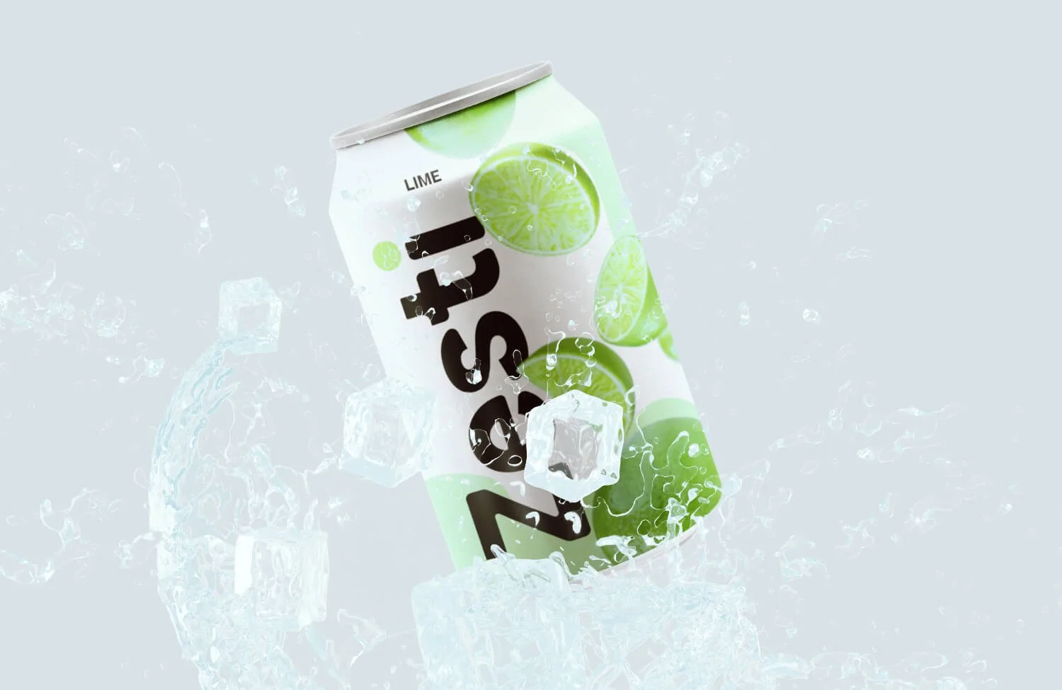
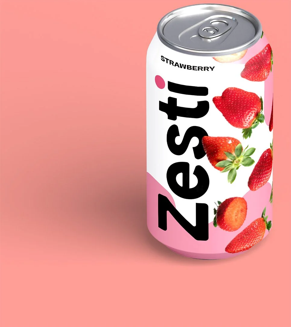
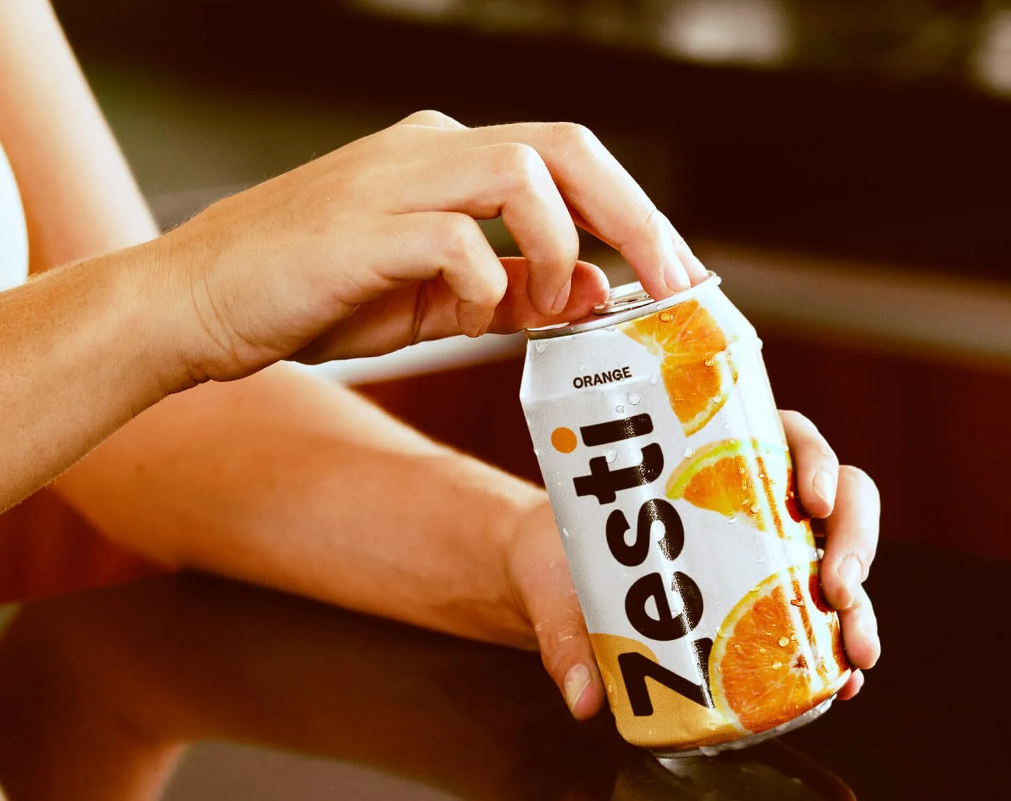
The logotype starts with a geometric sans and is modified to carry the brand's energy. Round and open enough to feel fresh, weighted enough to read at distance. The dot on the "i" shifts to each flavor's assigned color — one small detail doing the differentiating work across the whole line.
PALETTE
Five palettes, one per flavor, assigned to fruit
Apple, lime, lemon, strawberry, orange each get their own color system. Saturated and direct: the colors name the fruit rather than suggesting it. Coherence across the line comes from the system structure, not from forcing the flavors into shared tones.
CHARACTER
Vivid, specific, with some throwback
The brand draws on retro packaging conventions without becoming pastiche. Saturated color, fruit illustration, and a customized round wordmark combine into something that feels like it has history. A new brand that reads as established.
§ 04
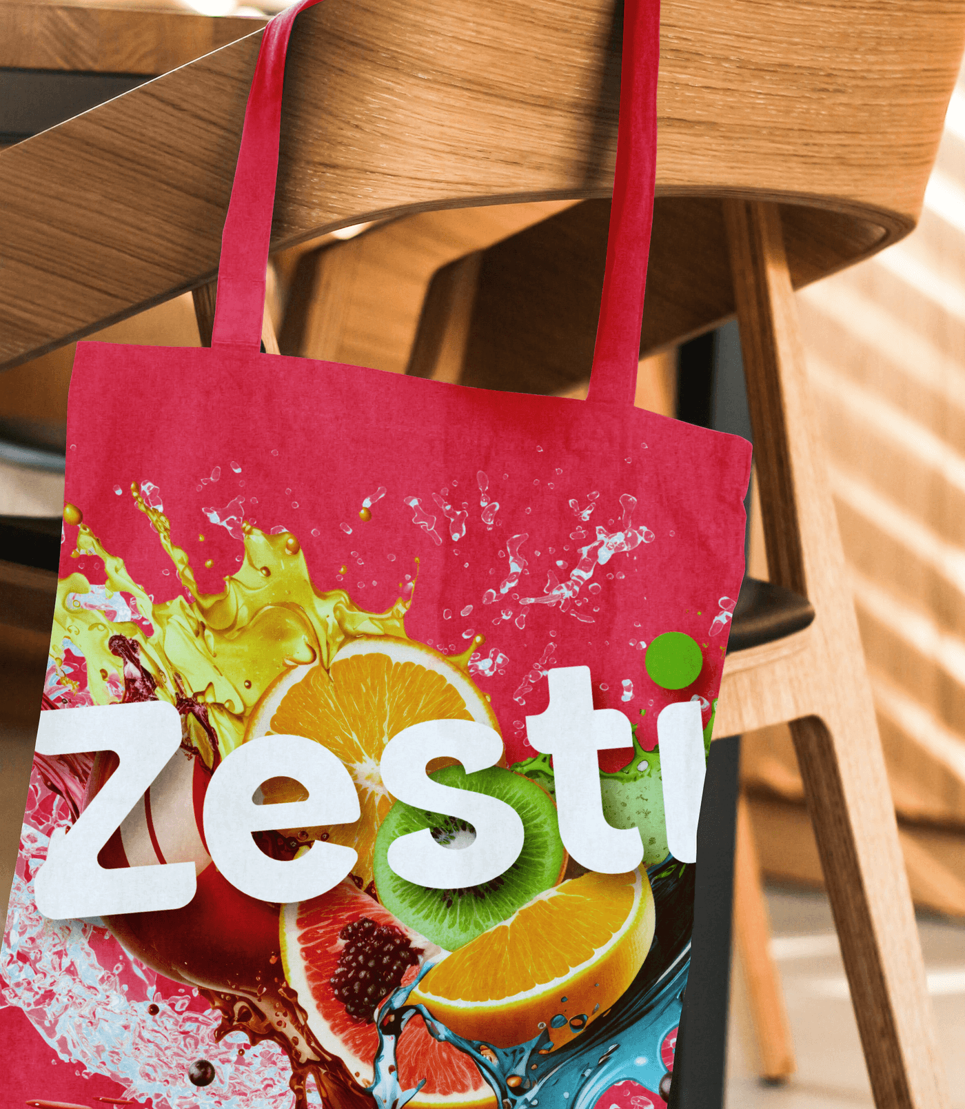
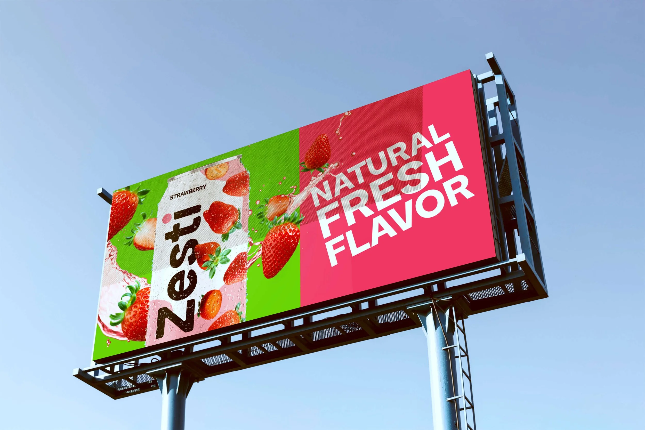
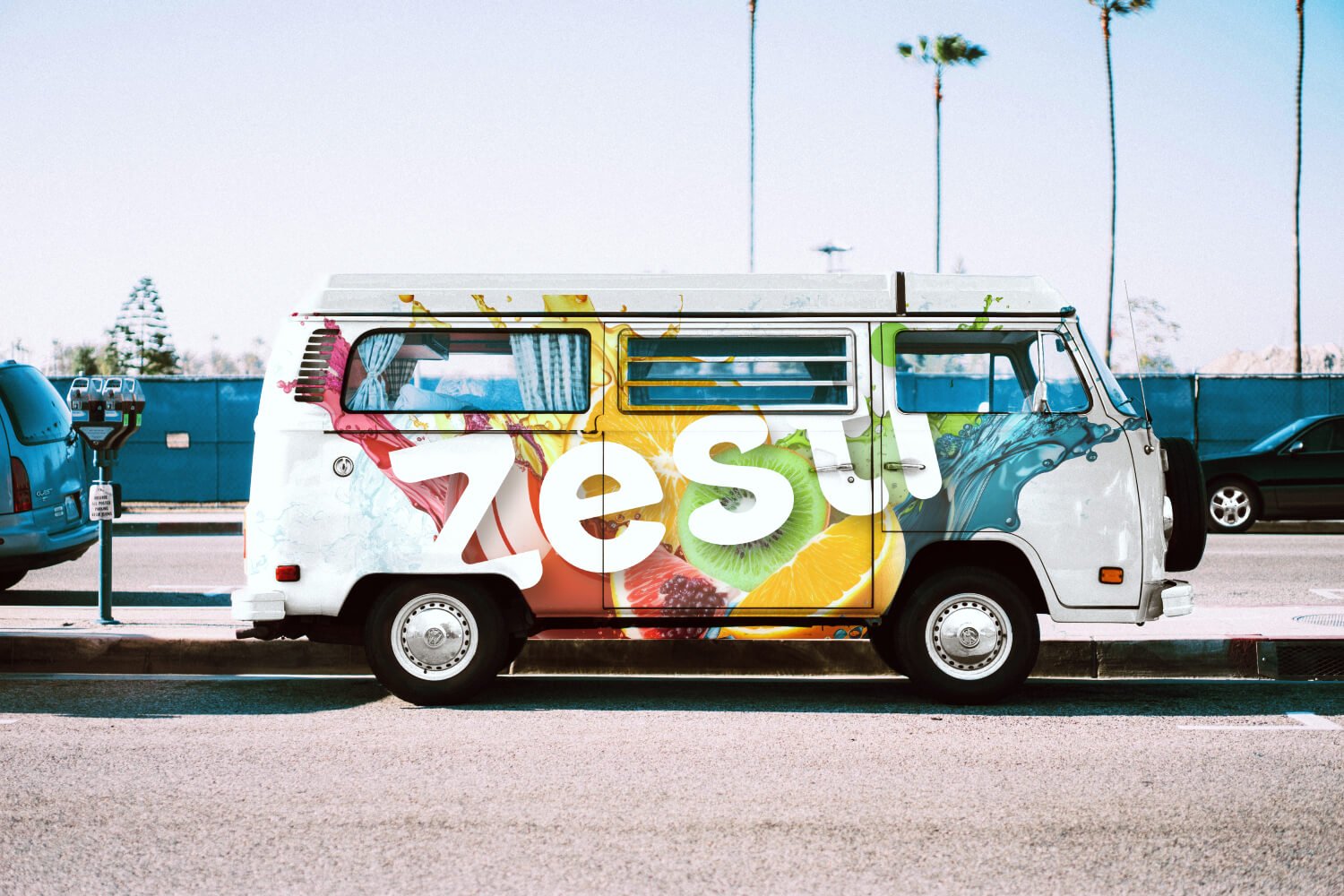
Application.
§ 05 - OUTCOME
What it became.
The flavor-specific color system makes each product immediately identifiable on the shelf. The mark stays consistent across all five variants; the palette and fruit illustration do the work of differentiation.
The throwback energy is earned rather than applied. The customized wordmark, the saturated per-flavor palette, the fruit imagery — each decision points in the same direction, and the cumulative effect is a brand that feels familiar.
The natural-drink category mostly equates restraint with credibility. Zesti runs on different logic. Bold color as specificity. The fruit on the can names the naturalism. The color names the energy. At shelf scale, both read at once.
§ RELATED
More work.
Nature with Nicola
IDENTITY & STRATEGY, WEB DESIGN

Roast & Toast
IDENTITY

Emily Salisbury
IDENTITY & STRATEGY, WEB DESIGN